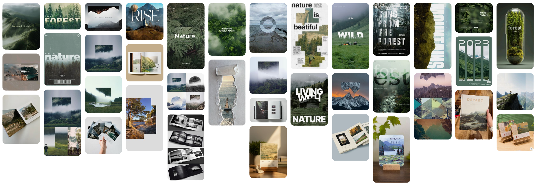
Visual Ideas
Here I have put together a mood board of visual ideas for different things that I could do for my final piece. Ranging from physical products like calenders and photobooks to more digitally based images using more effects and layering. I particuly like the way that some typography has been used in some of the images below to help make the text morph with the images.
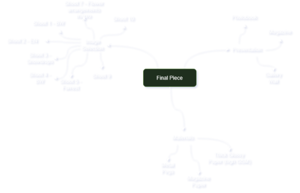
Mindmap
Below shows different aspects of my final piece that I need to consider like the presentation, materials, shoots & edits and contextual influences.
Inital Ideas
Below shows my inital ideas where I have drafted up some very inital ideas of 3 different things that I could do to present my images. I have spoken about magazine, photobook and a gallery wall as possible ways of presenting my work. I have then added some technical details
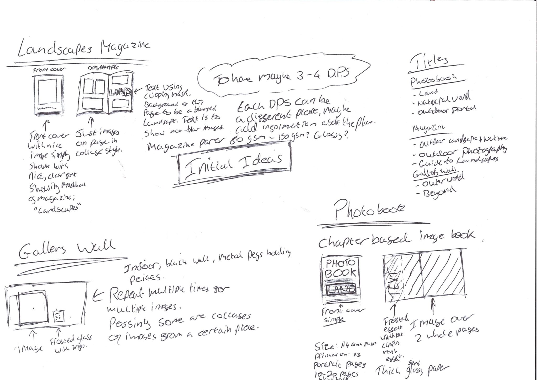
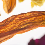
Image Selection
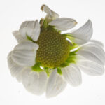
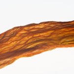
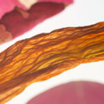
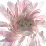
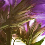
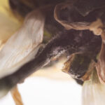
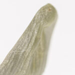
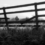
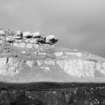
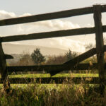
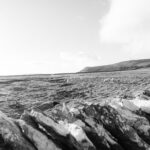
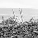
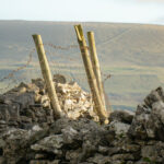
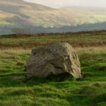
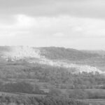
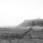
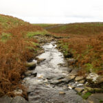
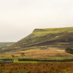
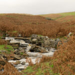
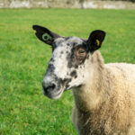
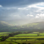
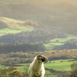
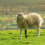
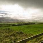
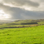
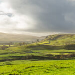
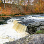
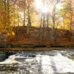
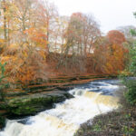
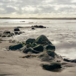
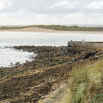
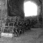
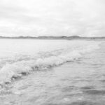
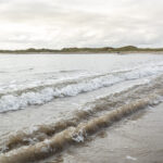
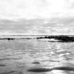
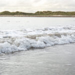
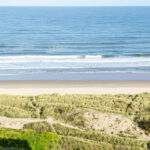
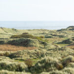
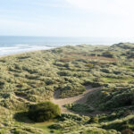
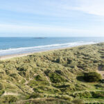
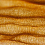
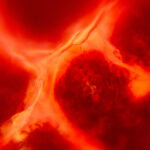
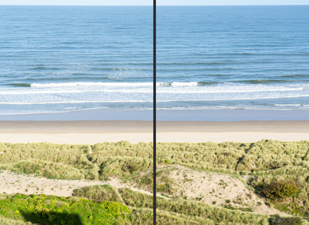
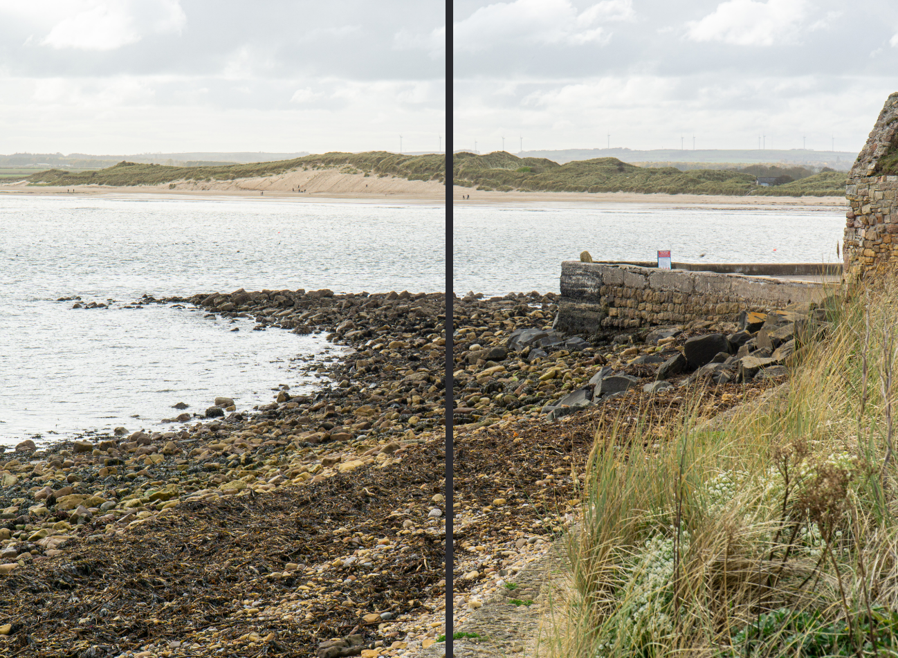
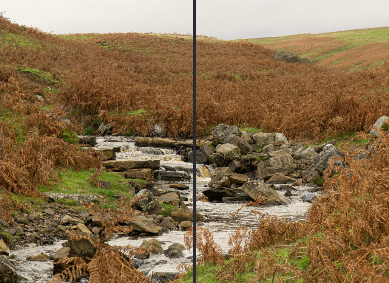
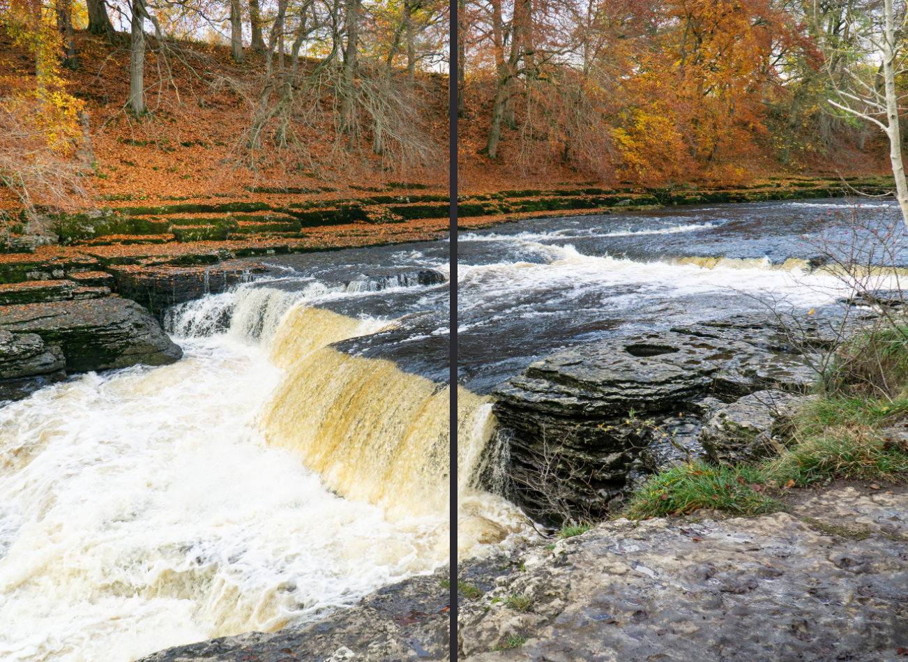
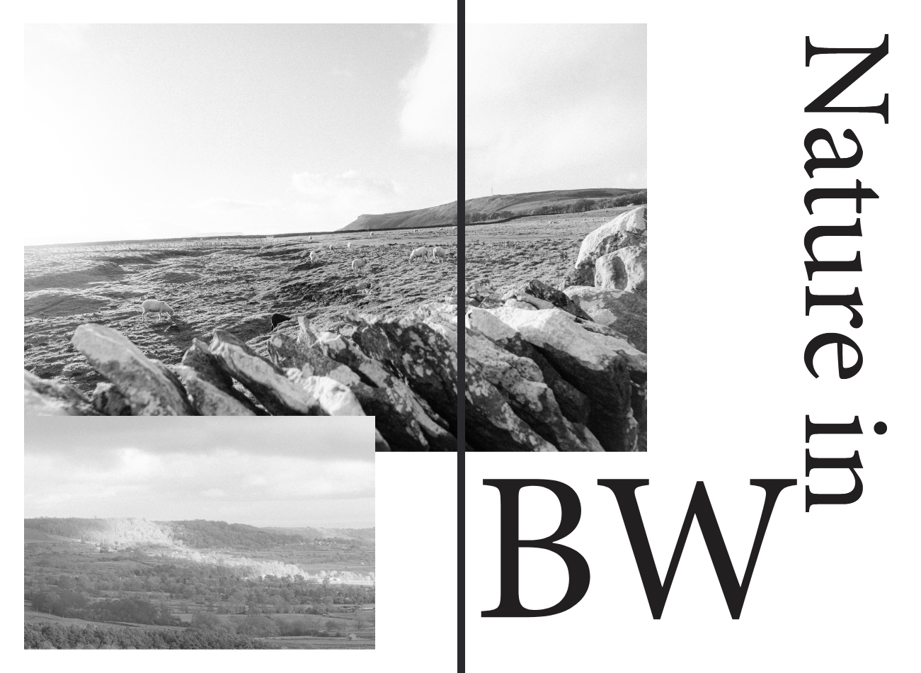
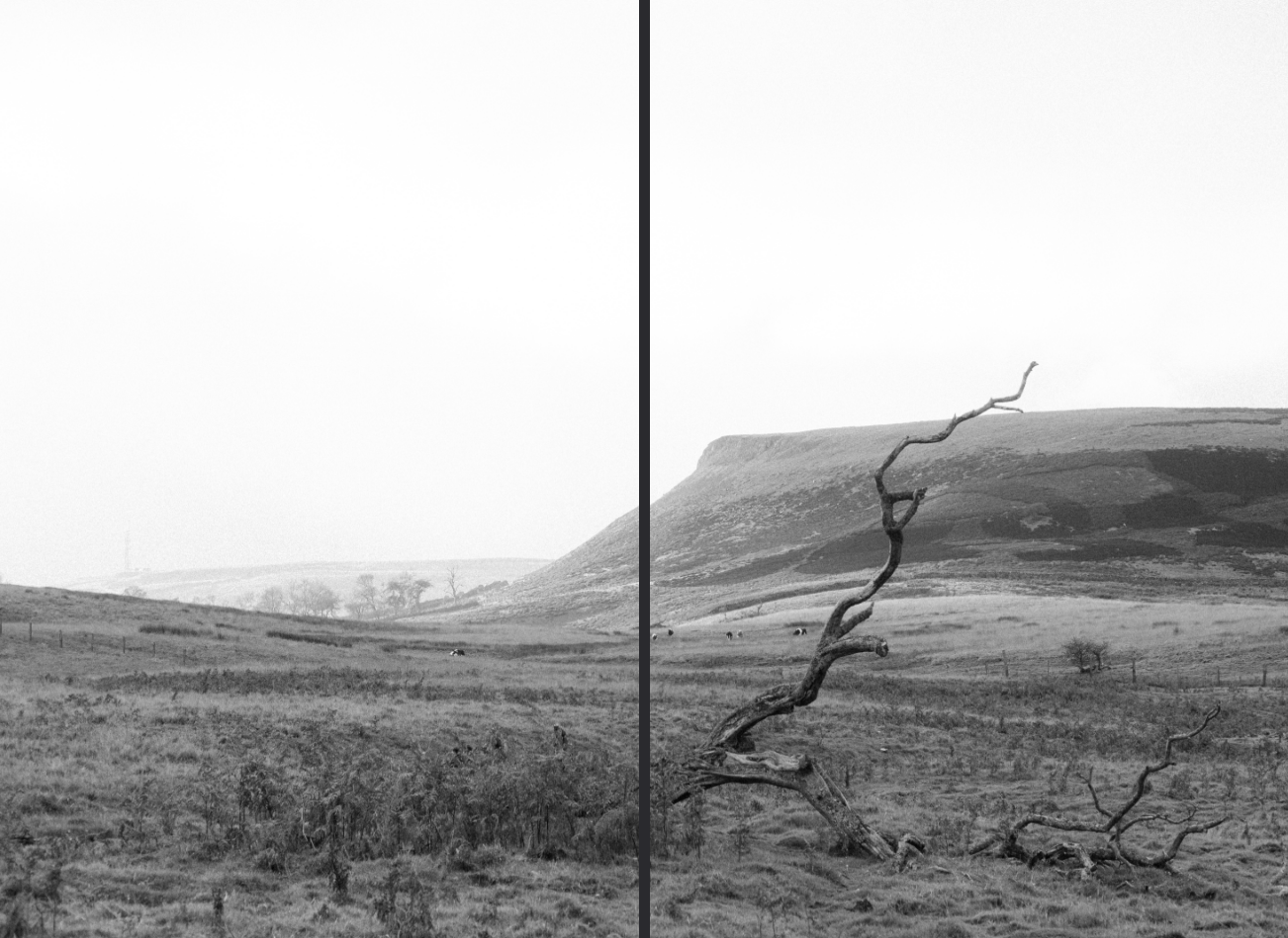
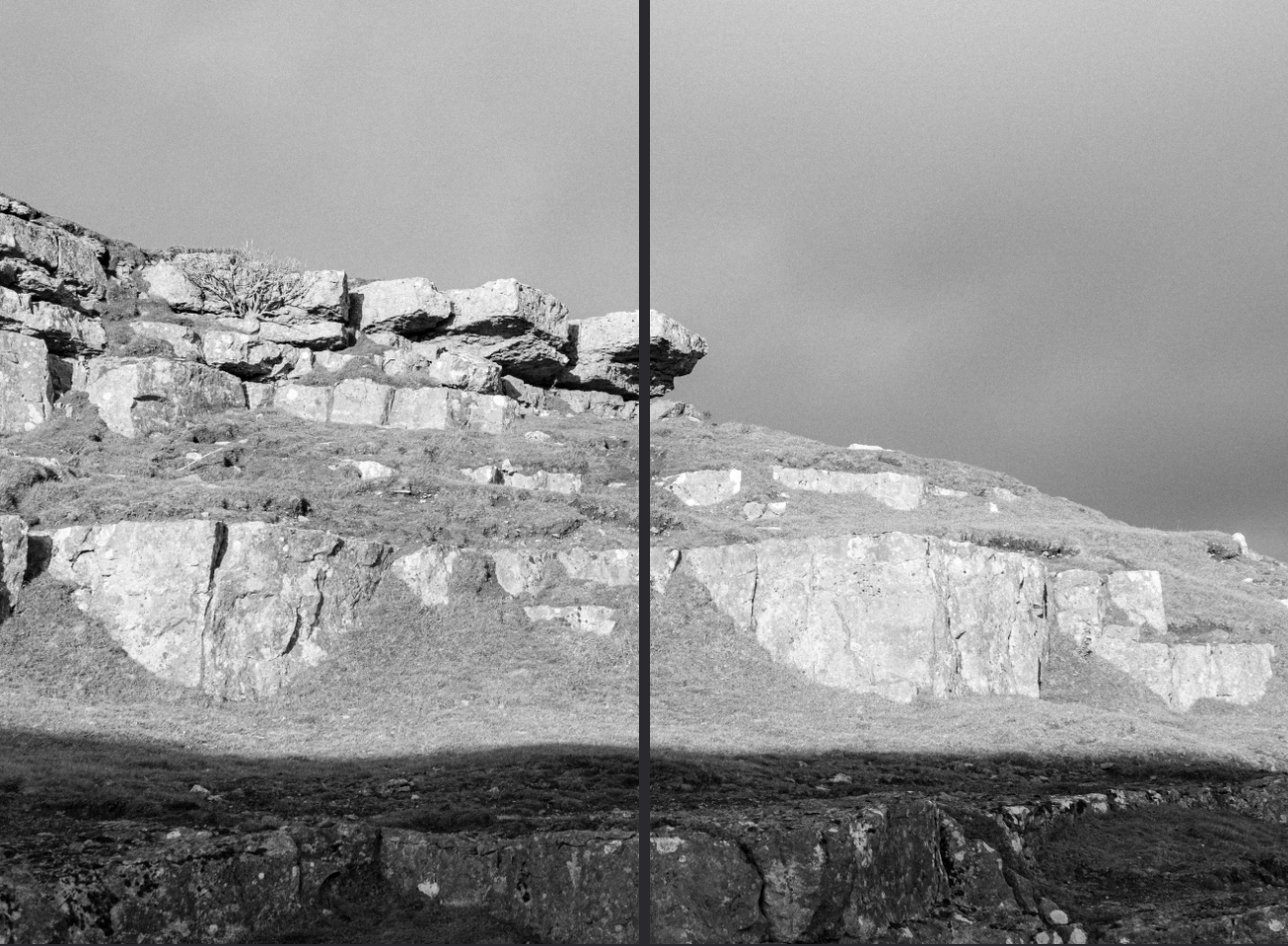
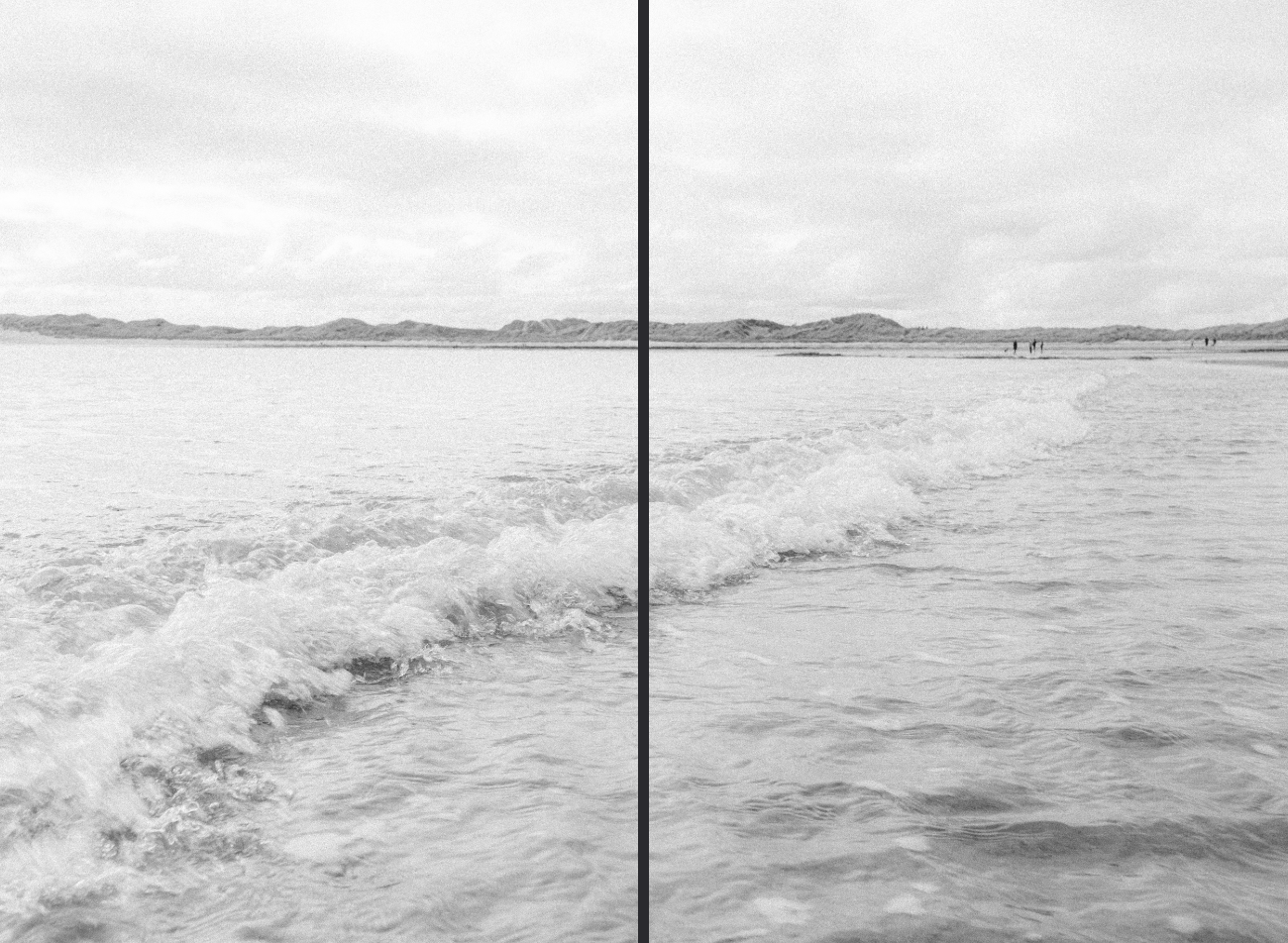
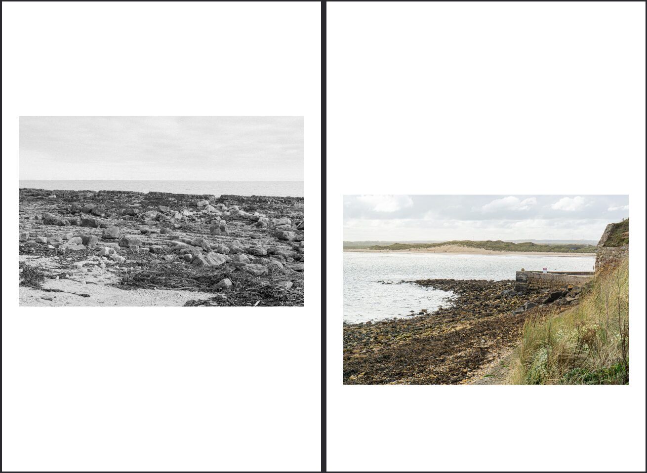
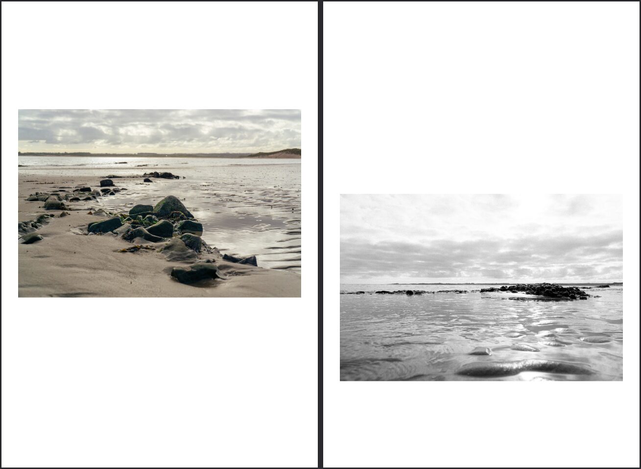
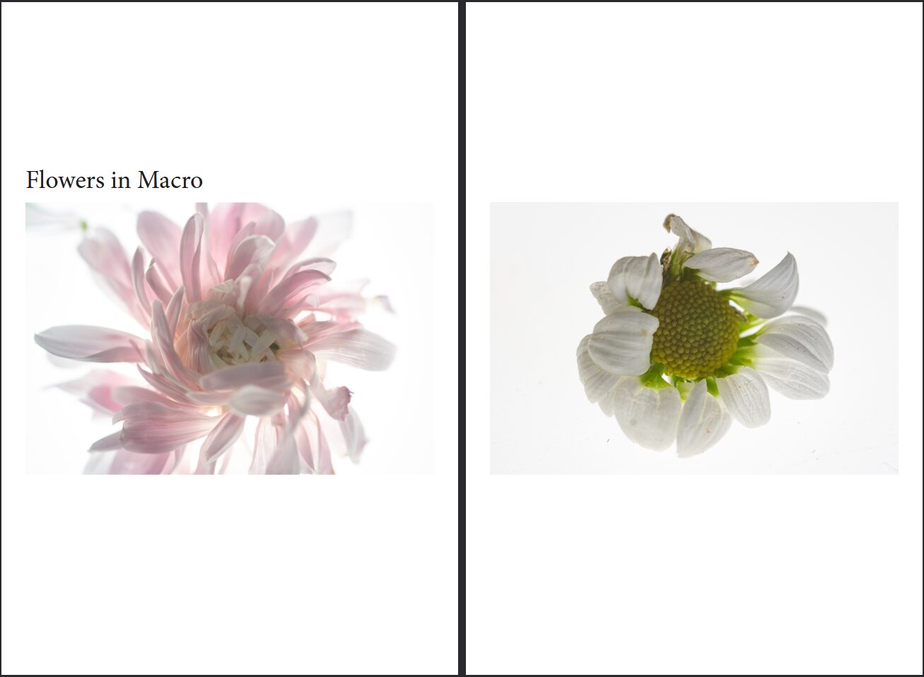
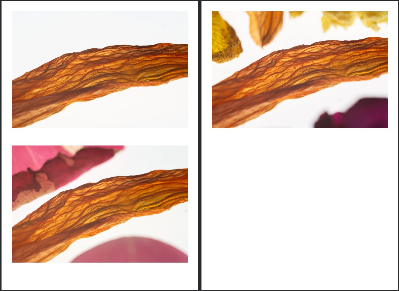
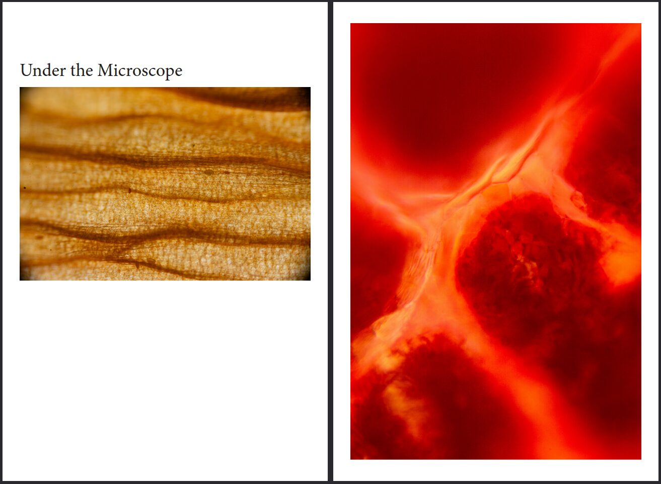
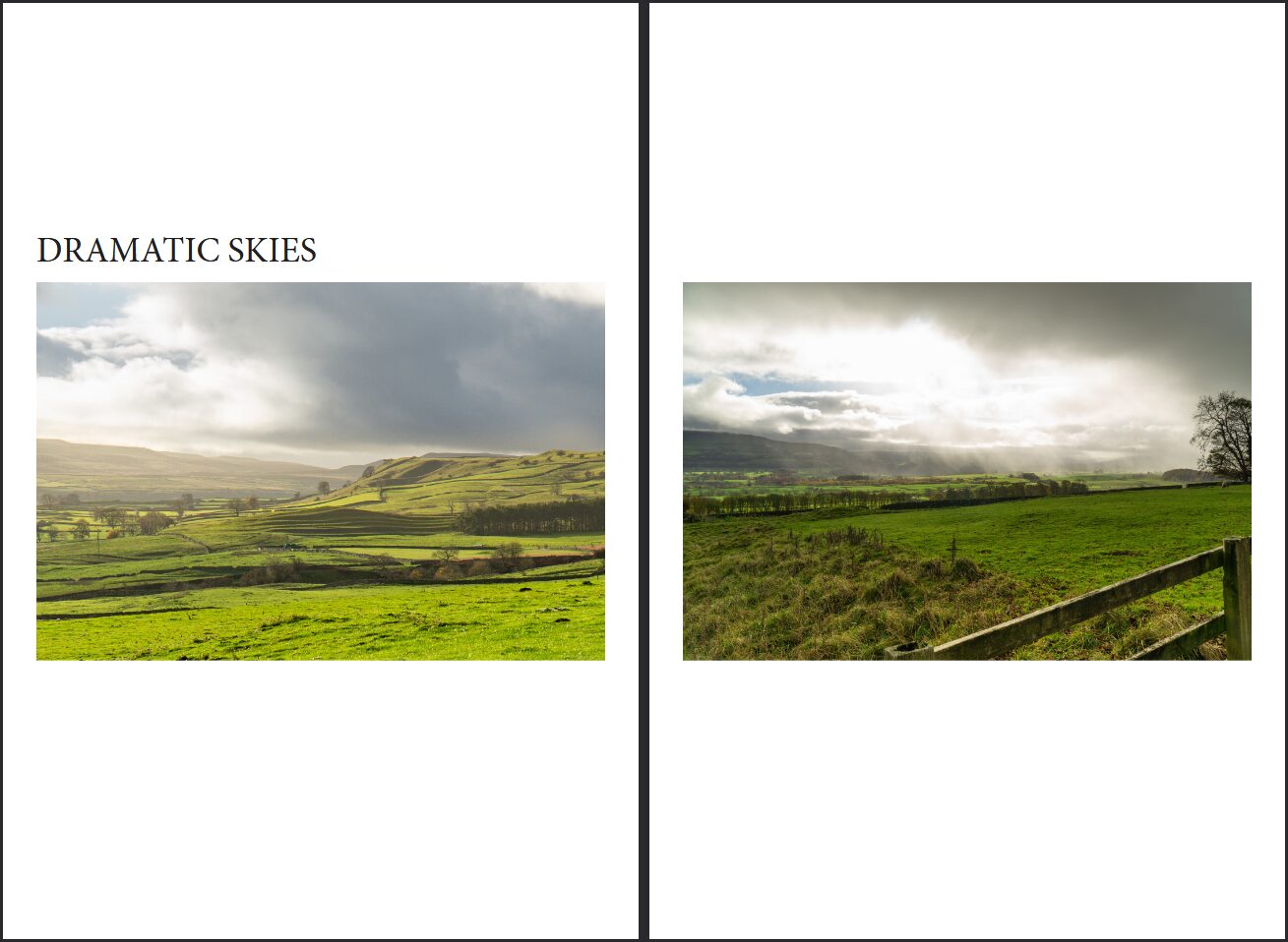
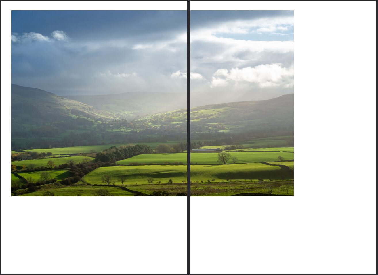
I have chosen these images for my final piece mainy because they are my favorites but also they are my best work, I am proud of the colour grading and how it brings out the details of the images and sets a mood that I am trying to convey and I think using these images in my final will make for a wonderful final product.
Consolidation of Ideas
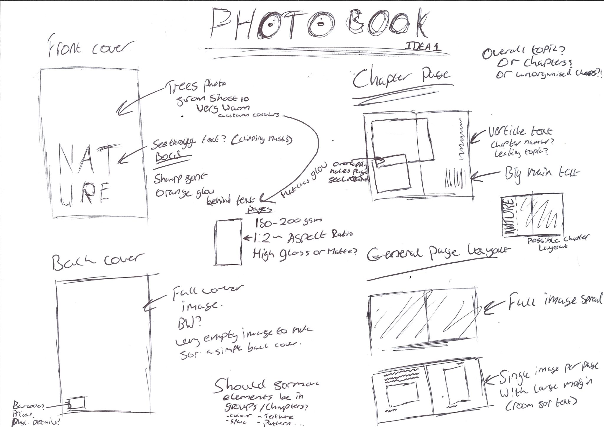
Idea 1 – Photobook
My first idea and my favourite idea is making a photobook, this would consolidate my work beautifully and allow me to show all of my different images rather than just one particular theme. A photobook would also allow me to show my images bigger and as the main subject rather than a magazine where it would be distilled by lots of information around my images. Below is a sheet of research that I did into existing photobooks so I could make creative decisions on what I wanted my final photobook to look like and feel like in the hand. This also allowed me to discover different content styles found in photobooks.
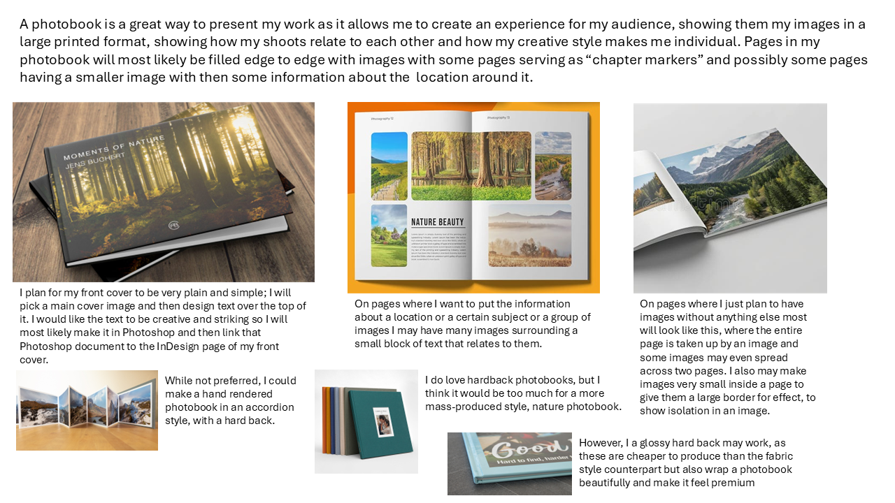
Below I have discussed possible layout ideas, content choices and media choice too, including the paper that I want to use. I have also spoken about how I will group images if at all.
InDesign Photobook
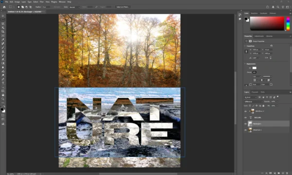
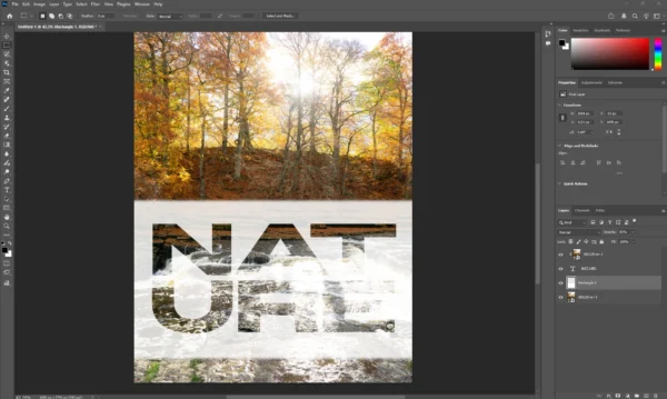
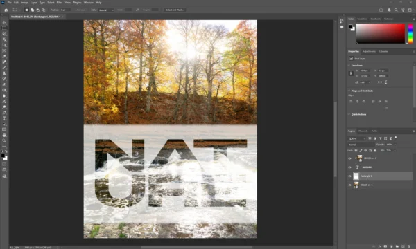
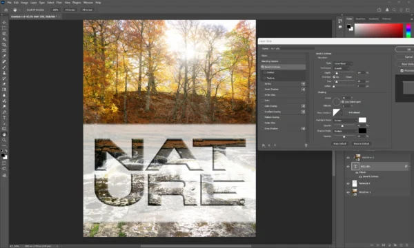
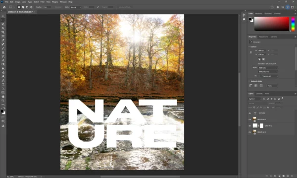
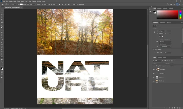
Experimenting with Front Cover Typography in Adobe Photoshop
Below is a few different choices I had for the clipping mask style, including using difference screening types, applying effects and blending options to the text layer, which can be seen from the bevel and emboss. Trying out adding a heavy blur to the rectangle object behind the text to see what it would look like if the text just has a glow behind it rather than a clear box and then experiementing with that by changing its colour, which can be seen in the final image in the gallery below, this ended up being my favourite style here.
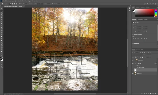
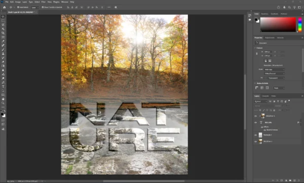
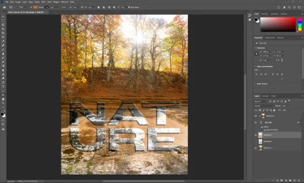
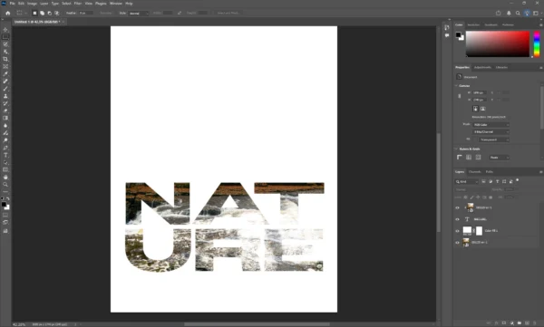
Process of making the clipping mask for the text
Working on the Photobook in Adobe InDesign
Even though I find InDesign a bit difficult, I wanted to make my Photobook in it for it’s sheer versitality and amount of tools that when used correctly can produce an amazing result. It is also amazing for safe printing.
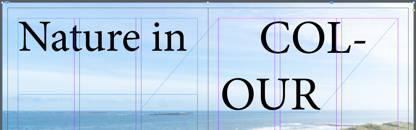
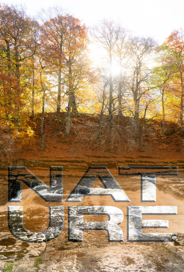
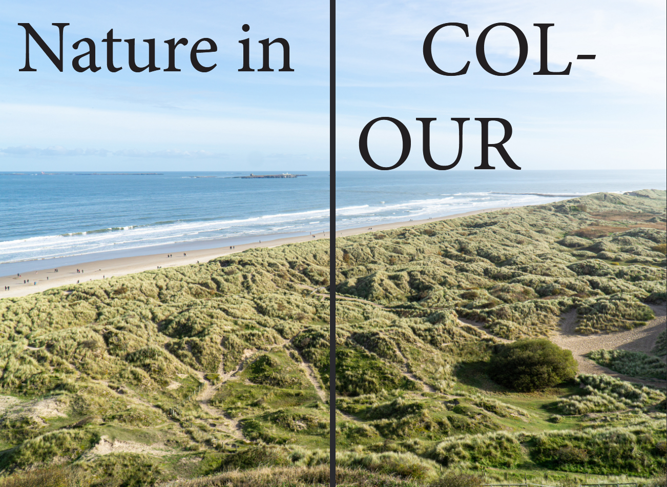
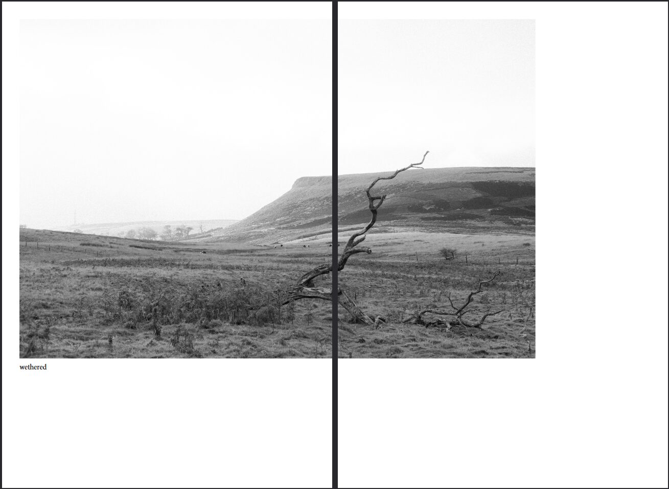
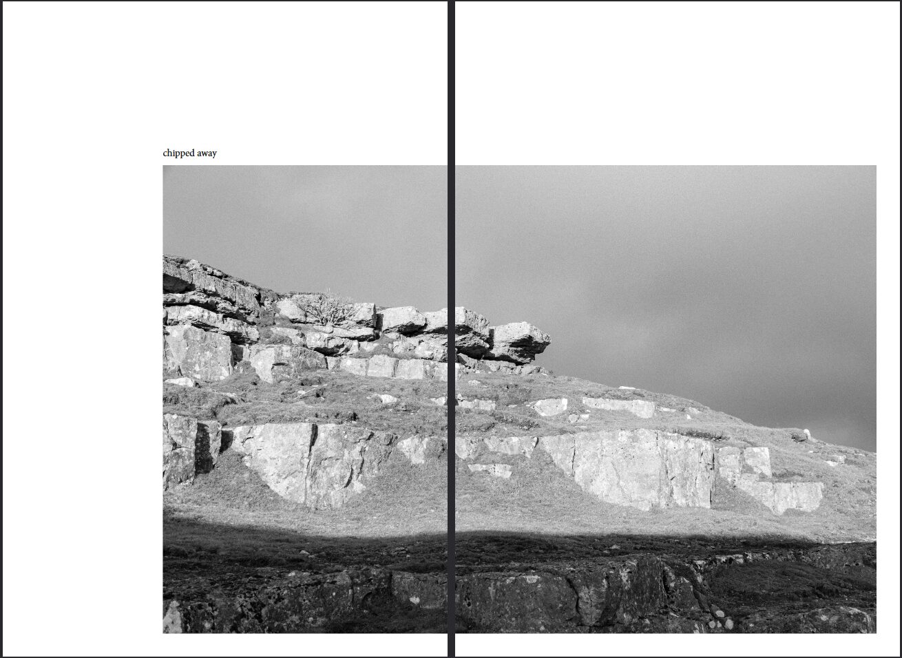
I wanted my Photobooks pages to have very large images, that are not very interupted. So this is what a chapter page looks like. I have scewed the text that fell to multiple lines and made it unique but while being integrated into the image. The “our” of “colour” lays perfectly on the horizon. For the black and white chapter page I have done something slightly different, I want it to make the black and white chapter page to feel more chaotic so I have made the text feel broken up and seperated and I have crossed over two images on the left hand side following the side of the text.
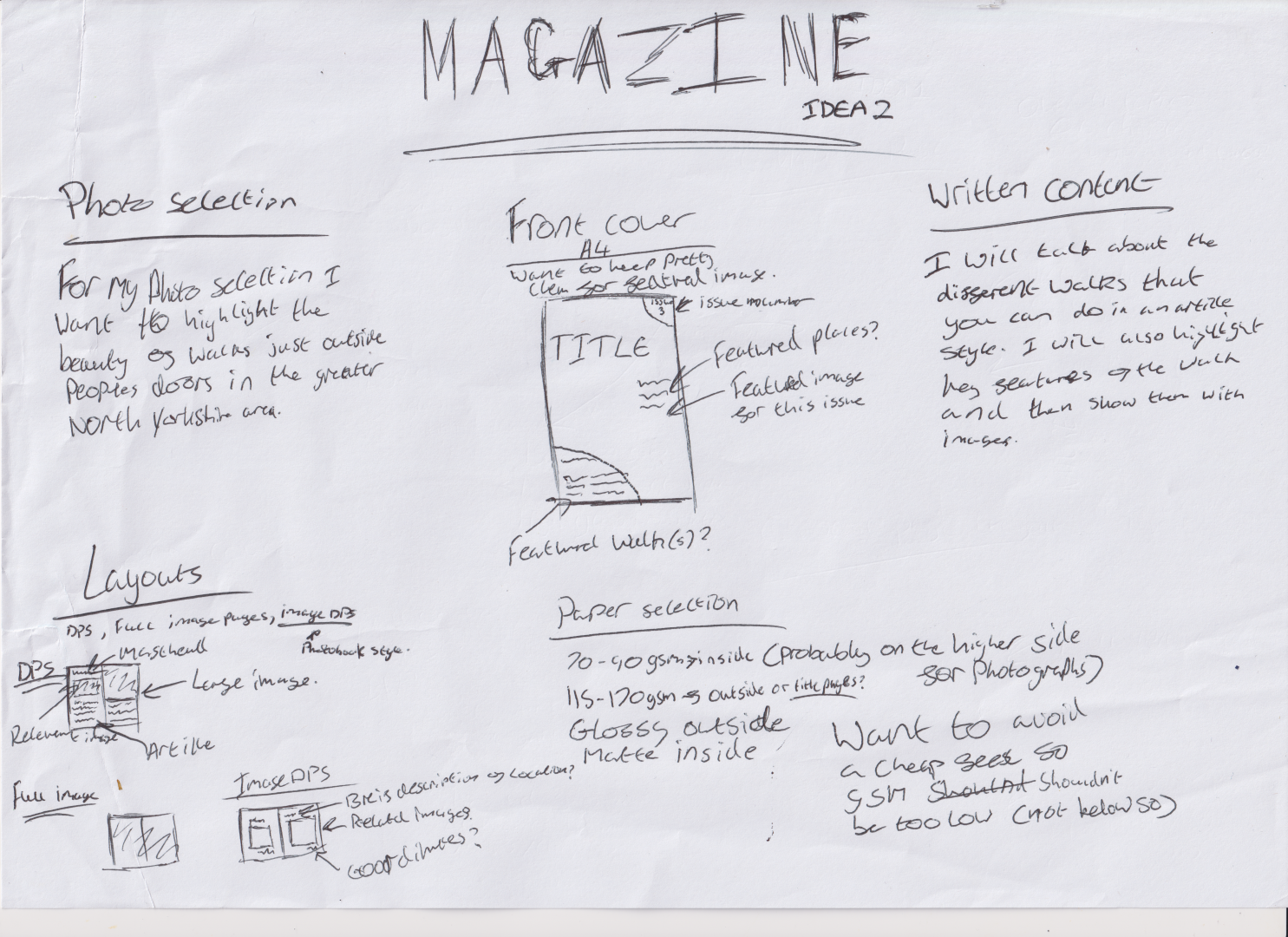
Idea 2 – Magazine
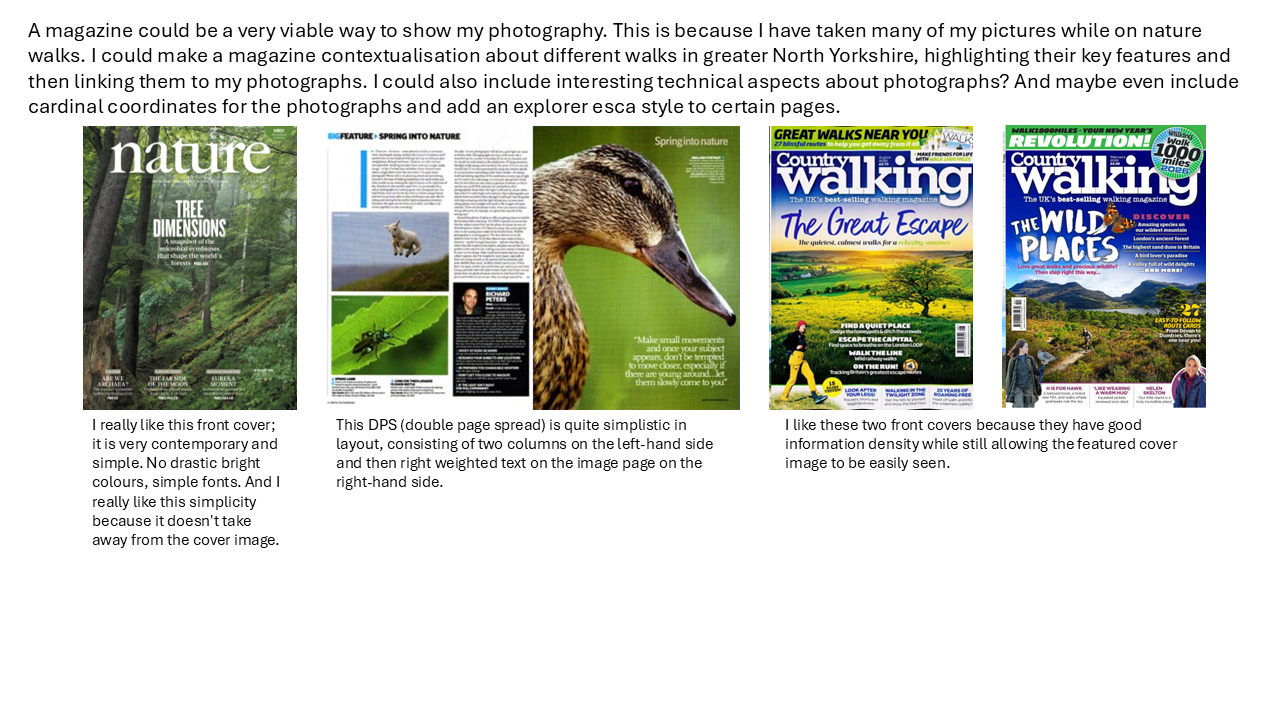
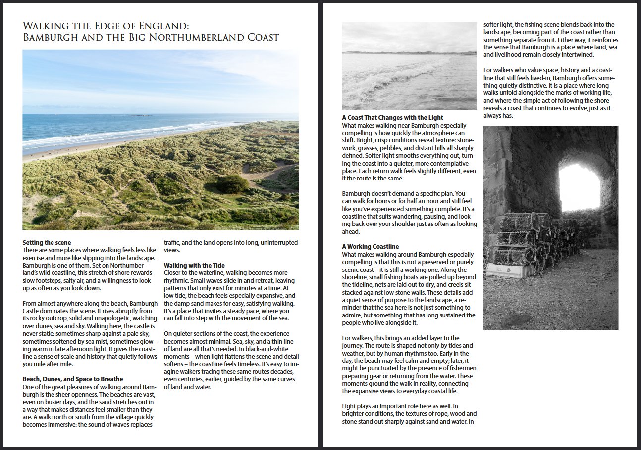
I have also considered the idea of making a magazine, probably one about different nature walks in North Yorkshire. I have consolidated some ideas already that I could utlise for a magazine. I have also included a page of research below into magazines and different examples that I have found that could inspire my magazine.
Below I have discussed possible layout ideas, content choices and media choice too, including the paper that I want to use. I have also then spoken about the content of the written content and how it will relate to my selected imagery.
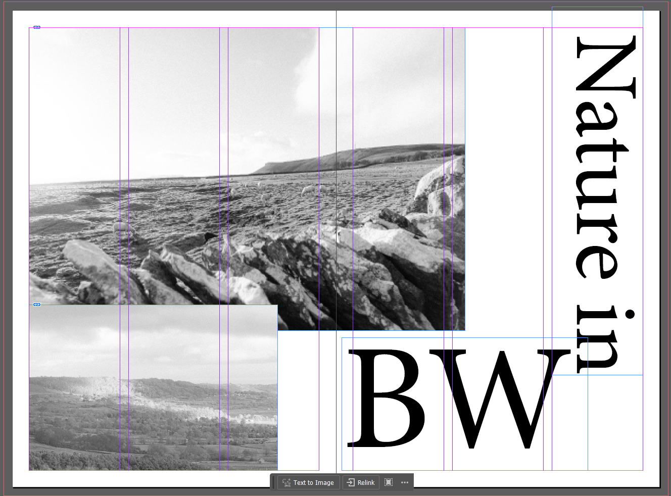
Experimentation with design of magazine
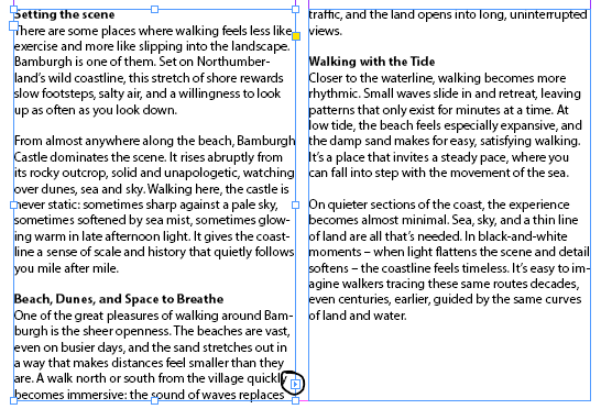
For my magazine mock up I decided to use Adobe InDesign, this is because of its powerful typing features but also the ease of use when it comes to organised pages via their column feature, text wrapping and text box linking for spread text.
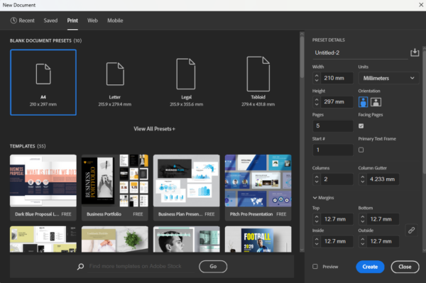
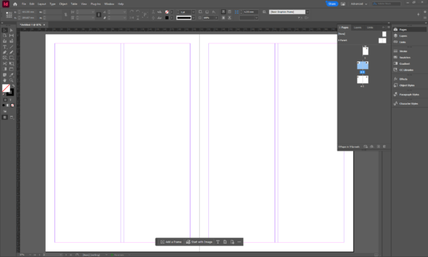
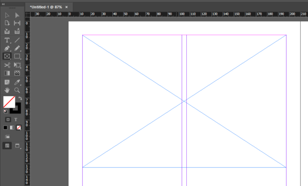
So first of all I had to make a document in InDesign, for this document I used the print template of A4 and then I made 5 pages so one for a cover and then 4 content pages for two double page spreads. Once I had the document made I ensured that my pages were correct and that I had one cover and two DPS content pages. Once I had confirmed this I started to use the rectangle frame tool to make placeholders for where my images were going to sit on the articles. I used text box linking in order to link the text boxes in different colums to keep the flow of text and make it easier for me to be able to put an article in without having to worry about the overflow into the text box next to it.
I made my article using ChatGPT 4o by OpenAI and prompted it with “walking magazine article about Bamburgh” and attatched three of my images for it to gain inspriation from.

Final Contextulisation
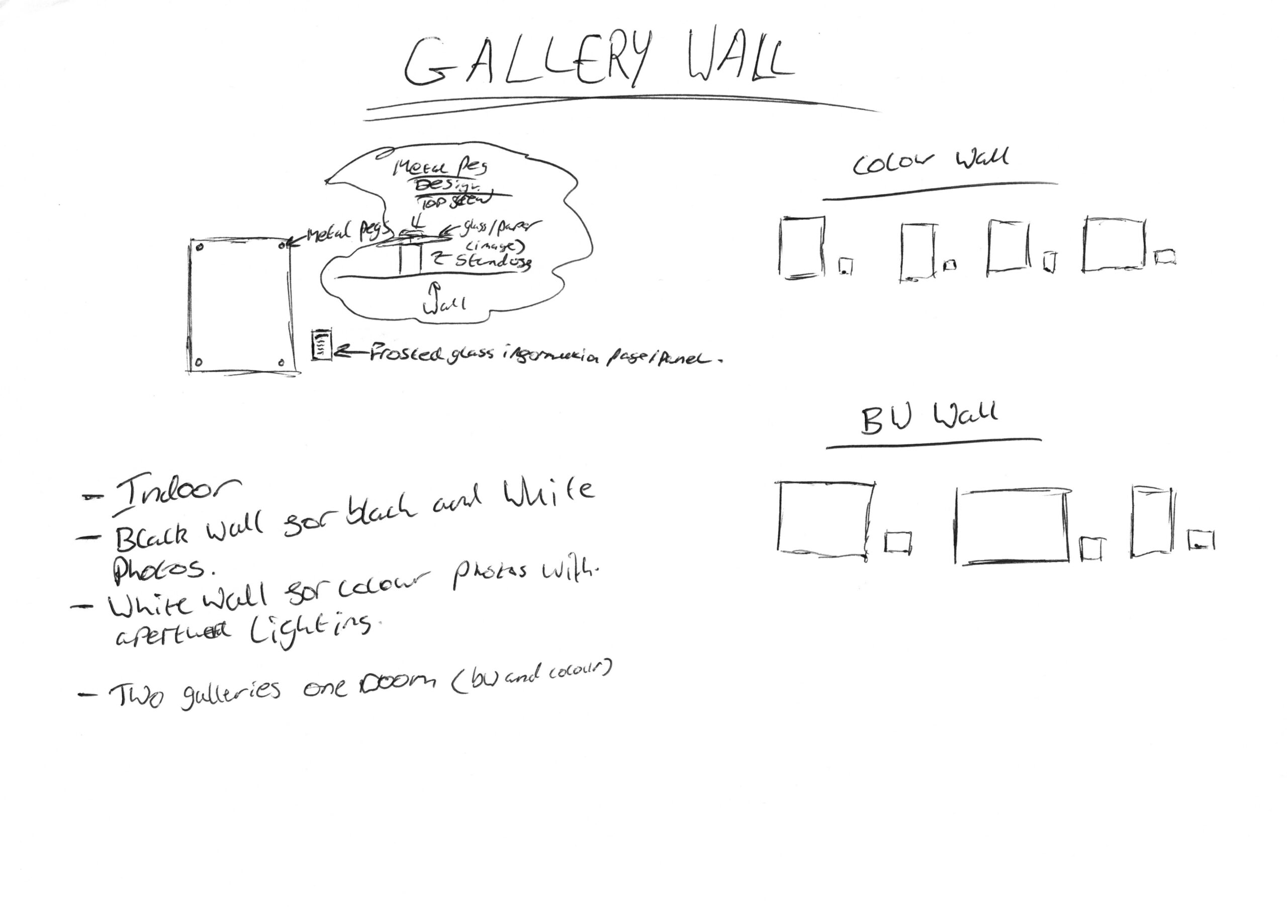
Idea 3 – Gallery Wall
The following is research into different galleries that will effect my artistic decisions for a gallery wall. I have tried to find a range of different galleries for me to discuss and then use as examples for my contextulisation of my different images.
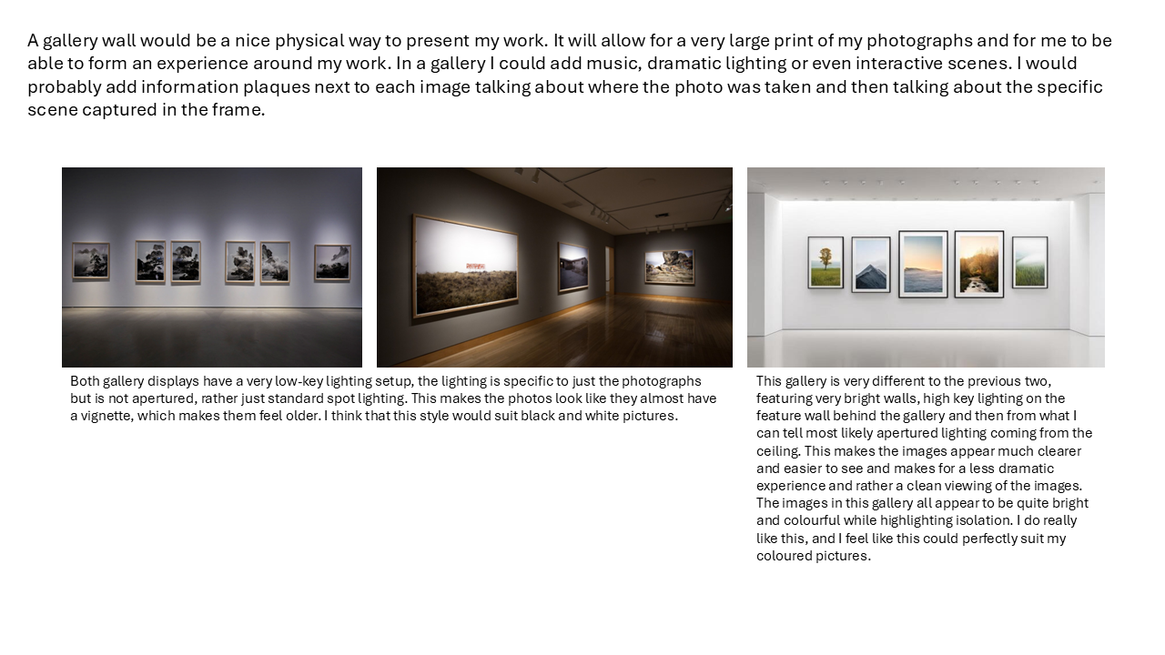
Below I have discussed possible layout ideas, content choices and display choice too, including paper/print media choice, fixings and lighting. I have also spoken about possible written content next to the photographs like discussed in the previous screenshot.
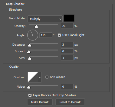
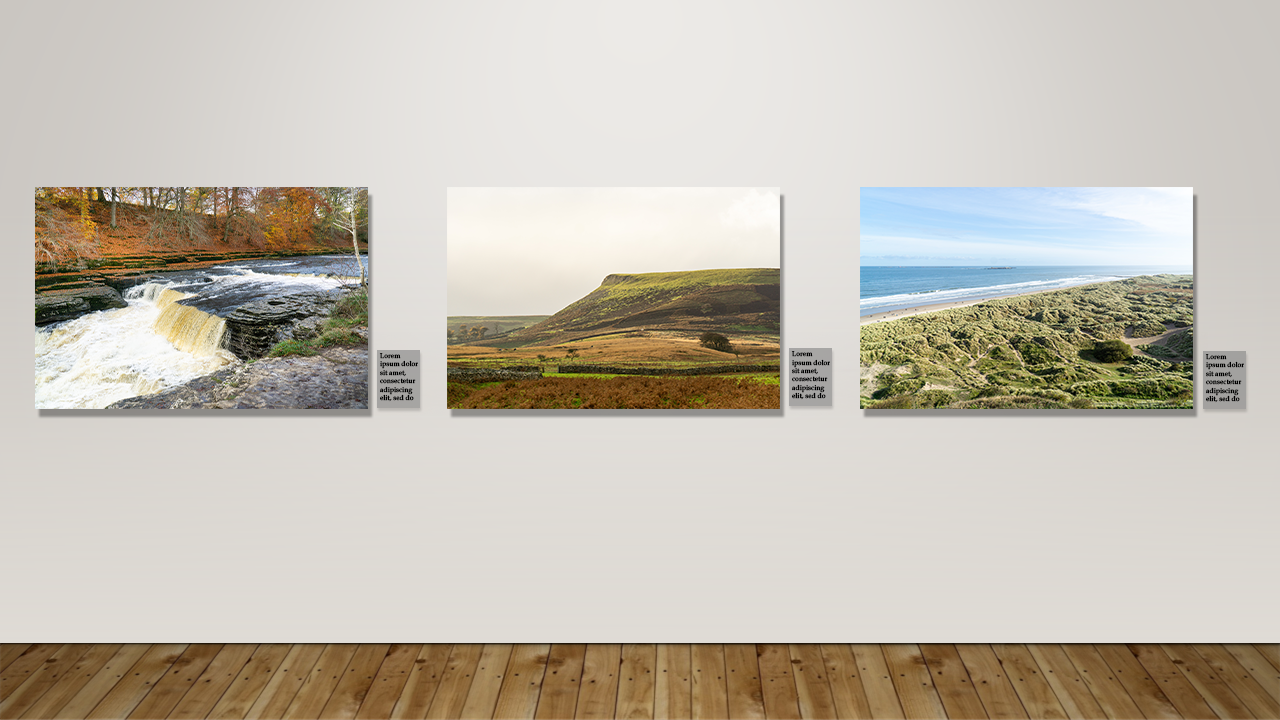
Experimentation with design of a gallery wall
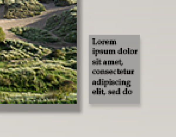
For this experimenation I found a picture online of a preexisting gallery and then used Adobe Photoshop to overlay my images instead. I will use blending options on my images to be able to add a realistic shadow to them and then I could also use the stroke option to add a border/frame. I ended up only adding a drop shadow as I thought adding a stroke would take away from original design idea of having hung panes of glass or other kind of hard media. In the screenshots below you can see that I used blending effects on each of the photos that I placed on the gallery wall and then you can also see how I did the information panes. The information panes are simply a rectangle where I also gave them a subtle drop shadow as they are supposed to be slightly transparent and then I filled them with placeholder text.
What did I chose to do and why?
I chose to make a Photobook, this is because I feel like it shows my photos in the most inspiring way without interuptions, most images take up a full double page spread each, giving them the most stage time they deserve. I did really like the idea of a walking magazine but I felt that it was too cluttered for what I wanted out of my project and the gallery wall just didn’t seem right for my photography and made them feel too comercial when I want them to be more personal to someone which is why I think the Photobook works so well here.
Draft photobook 1
In reflection to this draft I thought that it wasn’t quite like a photobook and more just felt just messy.. I didn’t like what was going on with the front cover and the chapter pages felt over the top and too experimental. I wanted to dial it back and make something better, so for my final I wanted to add more chapters with more overall images and make it more like a traditional photobook as to not take away from my photography.

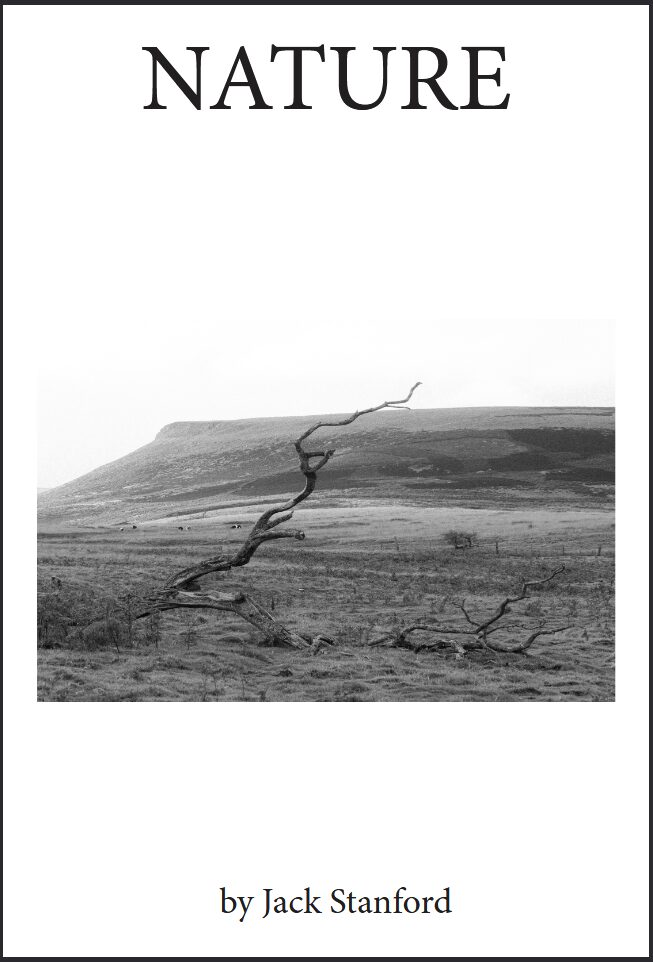
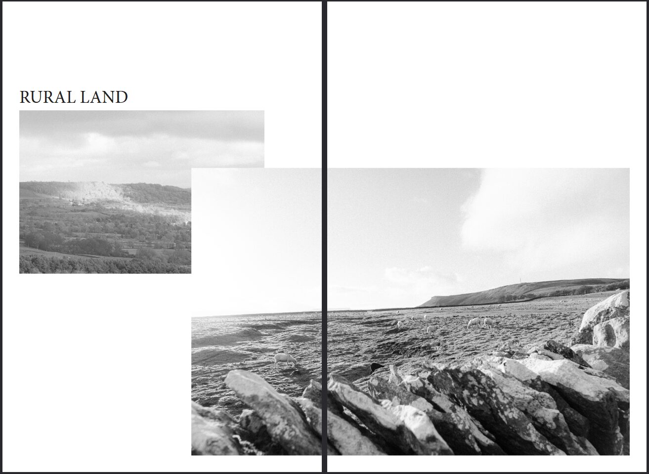
Final Product
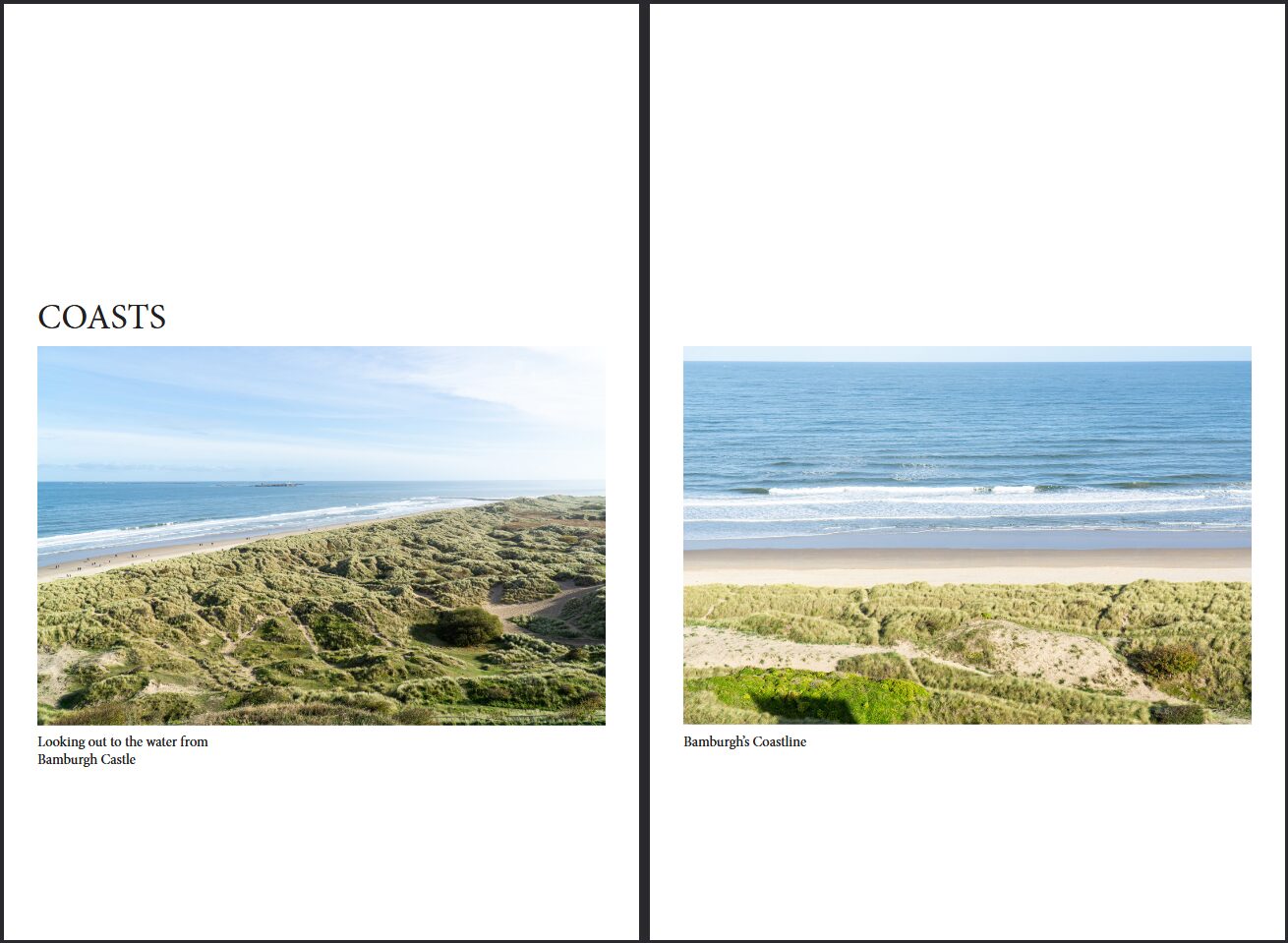
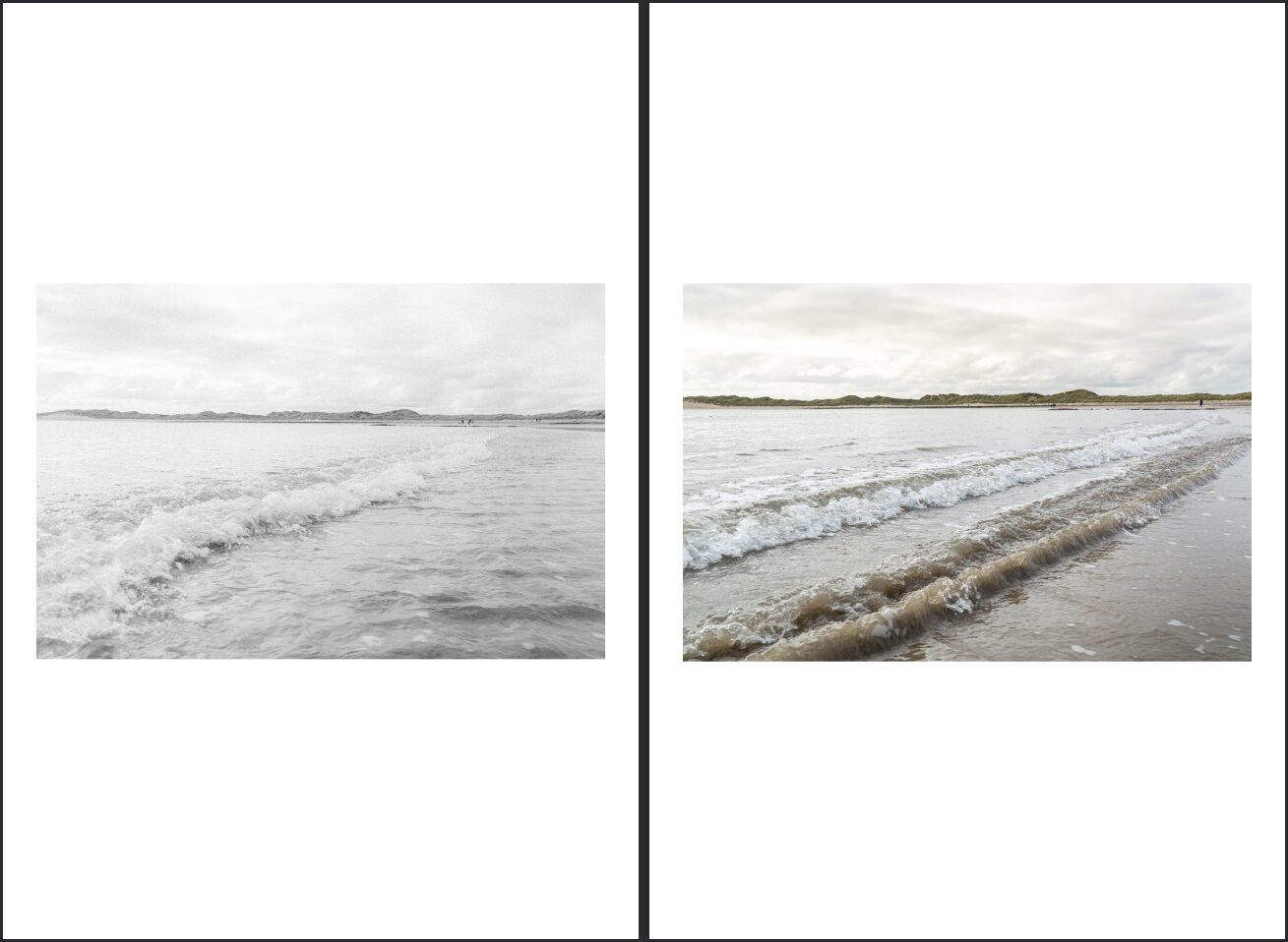
So, for my final product I wanted my front cover to be really simple so I used the same image as before but instead of being full bleed I instead scaled it down and added my title of Nature and then by Jack Stanford as an author text. I ended up doing some different layouts, where linked images would be side-by-side and in alignment where as images without relevance but on a DPS together will be staggered to show they are not meant to be connected directly.
If you want to view the final as a PDF, I have attatched it here. For best viewing experience please use even spreads.