Section 1 – Explain the main idea(s) for the development of your responses
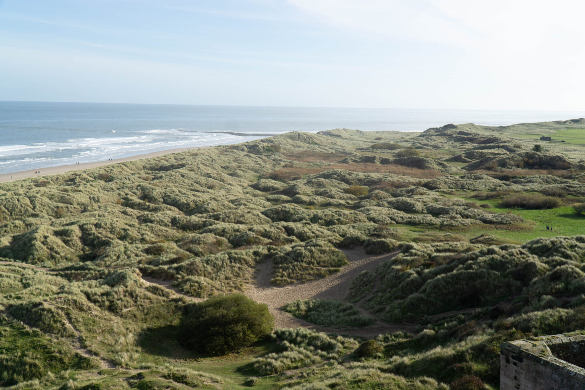
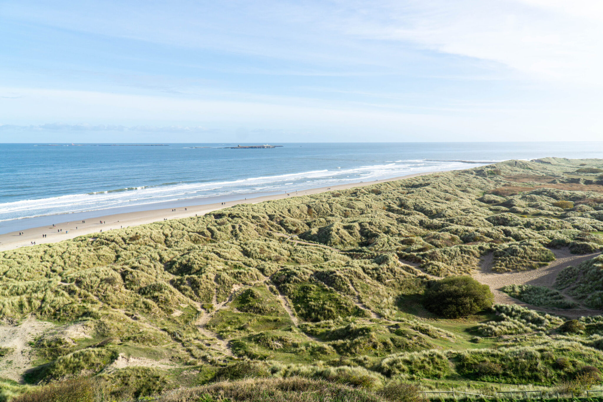
I want to investigate the natural environment; in particular landscapes, forests, flowers, and other elements of nature that capture texture, colour, and mood. I plan to visit locations around me in the North East of England, such as coastal areas, countryside trails, forest parks, riversides, and nature reserves. I want to document scenes that are unique and interesting, such as dramatic skies, symmetry in natural formations, vibrant wildflowers, repetition in plant life, and the textures of bark, rocks, and water. Compositions will follow the rule of thirds and leading lines. I will use deep depth of field in some images to keep the entire scene in focus, creating a clear, detailed representation of the landscape. So far I have collected a range of contextual sources that approach my theme from different perspectives in order to broaden my ideas.
Following on from the workshops, I enjoyed the Environment workshops because I developed a deeper understanding of composition and just how important it is. They also showed me that depth of field doesn’t always have to be shallow to create a good image, as a deep depth of field can help capture the vastness and detail of a scene, particularly in landscapes and forest photography.
I plan to further explore depth of field (aperture) and composition in my images.
In terms of investigating formal elements, I want to focus on colour, including colour manipulation and colour palettes inspired by nature, from earthy browns and deep greens to vibrant floral colours and the soft pastels of sunrise or sunset. I also want to focus on pattern and repetition in the natural world, such as the arrangement of leaves, ripples in water, or the layered structure of petals, possibly expanding and dramatising them with layering and reflection or mirroring using digital manipulation.
I am going to explore perspective, including flat perspective for meadows or fields, low angles to enhance the height of trees or flowers, and aerial views possibly via the use of a drone to show patterns in the land or coastline.
I want to explore a range of natural lighting conditions. I will photograph in golden hour for warm tones and long shadows, in overcast weather for a soft, diffused mood, and in bright sunlight for vivid colours and crisp contrasts. I also want to experiment with early morning mist, reflections after rainfall, and night-time nature scenes, potentially using light painting with a torch to highlight specific natural features.
Section 1 – Reflection
In reflection, I feel like I have achieved the main aims I set out for this project including; understanding the use of depth of field, composition and also picking when to use lighting. I also feel that I have become more confident with the camera and am able to dial settings in quicker. Initially when I started the course I hadn’t used Lightroom much, it was nice to get stuck in and understand what each dial and slider did and how it affected my image. Using Lightroom I was able to take my RAW photos and develop stunning, dramatic pictures. I planned to take pictures of the natural environment and certain aspects of it, such as landscapes, flowers and forests. This is evident by many of my shoots. I also feel like I have managed to really understand just how important composition is for taking a good picture. My goal was to make atmospheric images that put the viewer there, in the moment. People were mostly omitted from my photos and that was to keep the idea of it just being about the nature. This will be clear once I produce my magazine/photobook final piece which will feature my favourite pictures from my shoots and really show just how beautiful nature really is.
In shoot 2 I have focused on creating a warm and dreamy look and feel, see figure 1. In shoot 3 – I have also explored negative space, depth of field and adding a light leak in Lightroom, see figure 2. In shoot 4 I experimented with extremely long shutter speeds via the use of the BULB feature on my camera, where you hold the shutter button for the period you want the shutter to remain open. Doing this yielded quite a bright image for what was pitch black nighttime, most of the light in the scene coming from the moon but the main centre piece for me is the lamp in someone’s window that has become so bright it looks like the sun and is even flaring in the lens elements. Continuing the theme of low light in shoot 4, there is figure 4 where I have used flash photography on a pitch black country road to get an ominous picture, I have then significantly boosted the exposure in post and added more grain to what was an already very dirty image, creating an unsettling picture of a road that goes into darkness completely covered by trees, the black and white adding to this ominous feel.
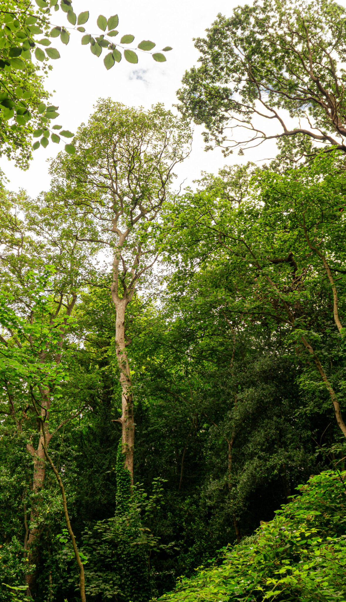
Figure 1 – Shoot 2
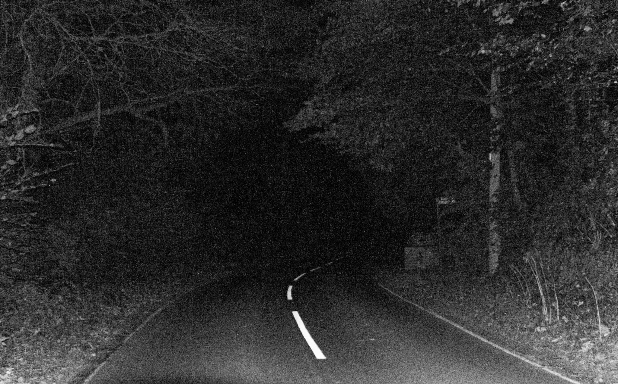
Figure 4 – Shoot 4
Figure 2 – Shoot 3
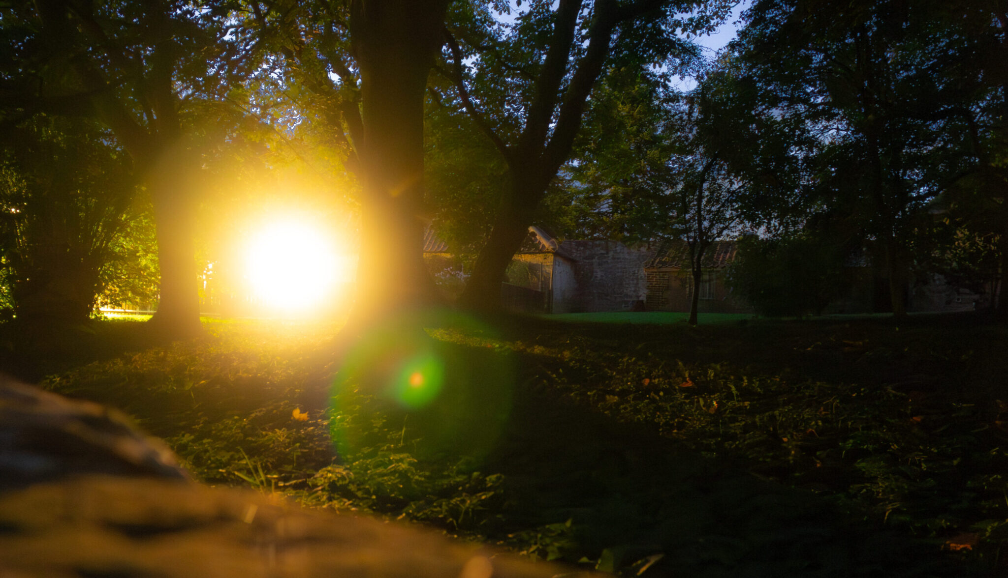
Figure 3 – Shoot 4 – Experimentation with extreme shutter speed
Section 2 – Outline your plan(s) for the development of your work
So I plan to develop my work by exploring digital software, including Lightroom and Photoshop. Following on from the workshops I plan to use Lightroom to select and enhance a range of images from each shoot using the develop tab, in particular the exposure, contrast, shadows and highlights, then moving onto the colour mixer and HSL sliders to adjust the colours in my images to be truer to life or dramatized for effect. I have then also used masking to localise effects in only certain areas of my images. I also often find that I want to go back and slightly recompose my images via the use of the crop tool, a lot of the time it is just removing a singular branch from a tree by just cropping in a little bit, otherwise it feels like a floating tree. Other times it could be completely recomposing and image to focus on a certain aspect of the image. In addition to using Lightroom I plan to experiment further in Photoshop using gradient mapping by taking a black and white edit and then mapping a gradient to it to make colourful edits. In camera I plan to develop my recording skills, where I need to focus mainly on exposure via use of the histogram where I want to expose-to-the-left, doing so will mean that my brightest areas of my image remain correctly exposed, so I do not loose details in the highlights of my images. However, in shoot 5 when I was in the forest shooting into the trees I experimented with exposing-to-the-right and I did the same in shoot 9 when taking pictures of the coastline. Doing so meant that I ended up with a softer look in my highlights, less detail and felt dreamier straight out of camera, which I felt complemented the composition of these images nicely. I also found that with exposing-to-the-right I ended up with lots more detail in my shadows in my images, being able to really pull lots of detail and colour out the trees in the forest and the ocean on the coastline.
Figure 5 – Shoot 5 – Showing details in trees by overexposing image in camera
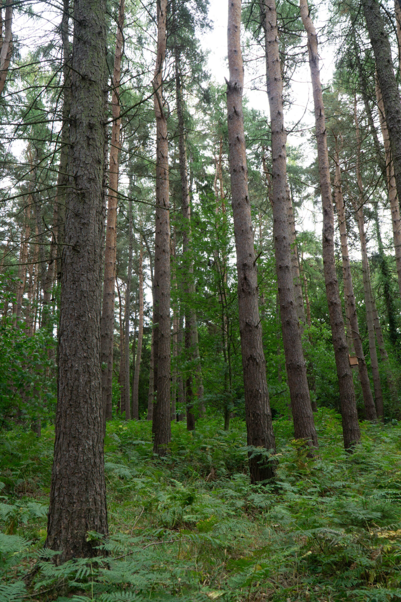
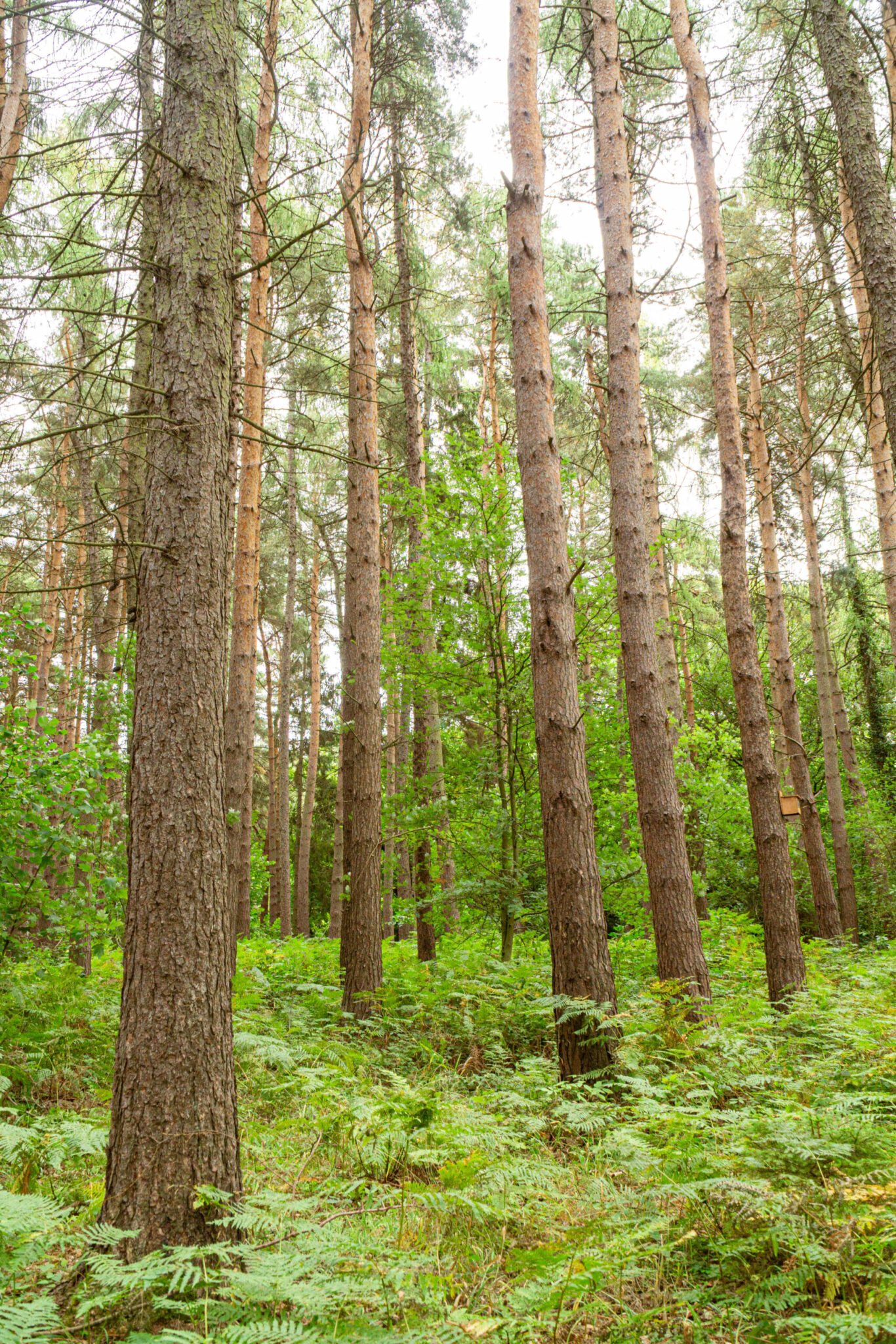
Figure 6 – Shoot 9 – Unedited and edited pictures of coastline to demonstrate exposing-to-the-right
Section 2 – Reflection
In reflection, I feel like after using Lightroom for the workshops and then the duration of this project I have developed from just working in the Basic tab to moving into colour mixing and HSL to really adjust colours to make them vibrant, truer to life and pop off the screen. This is already well highlighted in Figure 5 and 6 above. Adding to this I found that I sometimes ended up with an image that did not look true to life and in my opinion looking back on some of the first images that I used the colour mixer wheels and HSL on, I do not like their outcome. For one example, which I will now talk about see figure 7. In this image the shadows are way too blue and cool, creating an over contrasty look and then the midtones are green/yellow making the sheep look dirty. Otherwise the composition of the image is good and the exposure is otherwise nice, just a poorly colour graded image. However, in contrast to this I started to learn a bit of colour theory and reliased for an image to look right you need a balance between the colours, while figure 8 is still not my favorite example instead the edited figure 5 is, I do like how the leaf came out, vibrant and constrasty but most of all; it looks true to life. The branch looks cold and wethered and the leaf is warm and brittle, colour mixing really saved this image in my opinion. Before, the image was way too blue due to the camera picking an incorrect colour temperature, the branch was nearly blue and the leaf felt empty.
Figure 7 – Example of poor colour grading
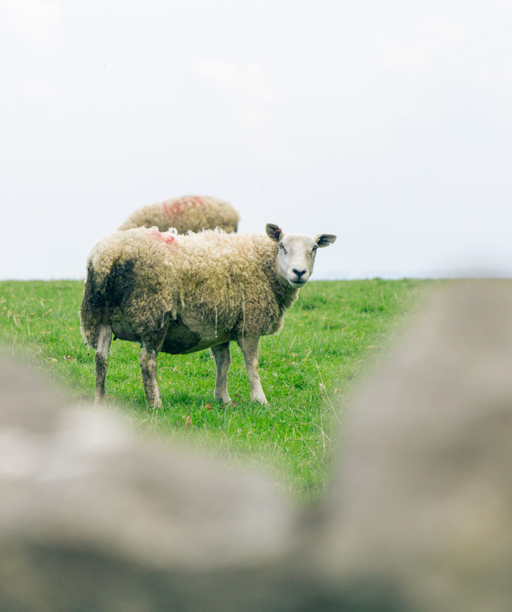
Figure 8 – Example of good colour grading adding to the feel of an image
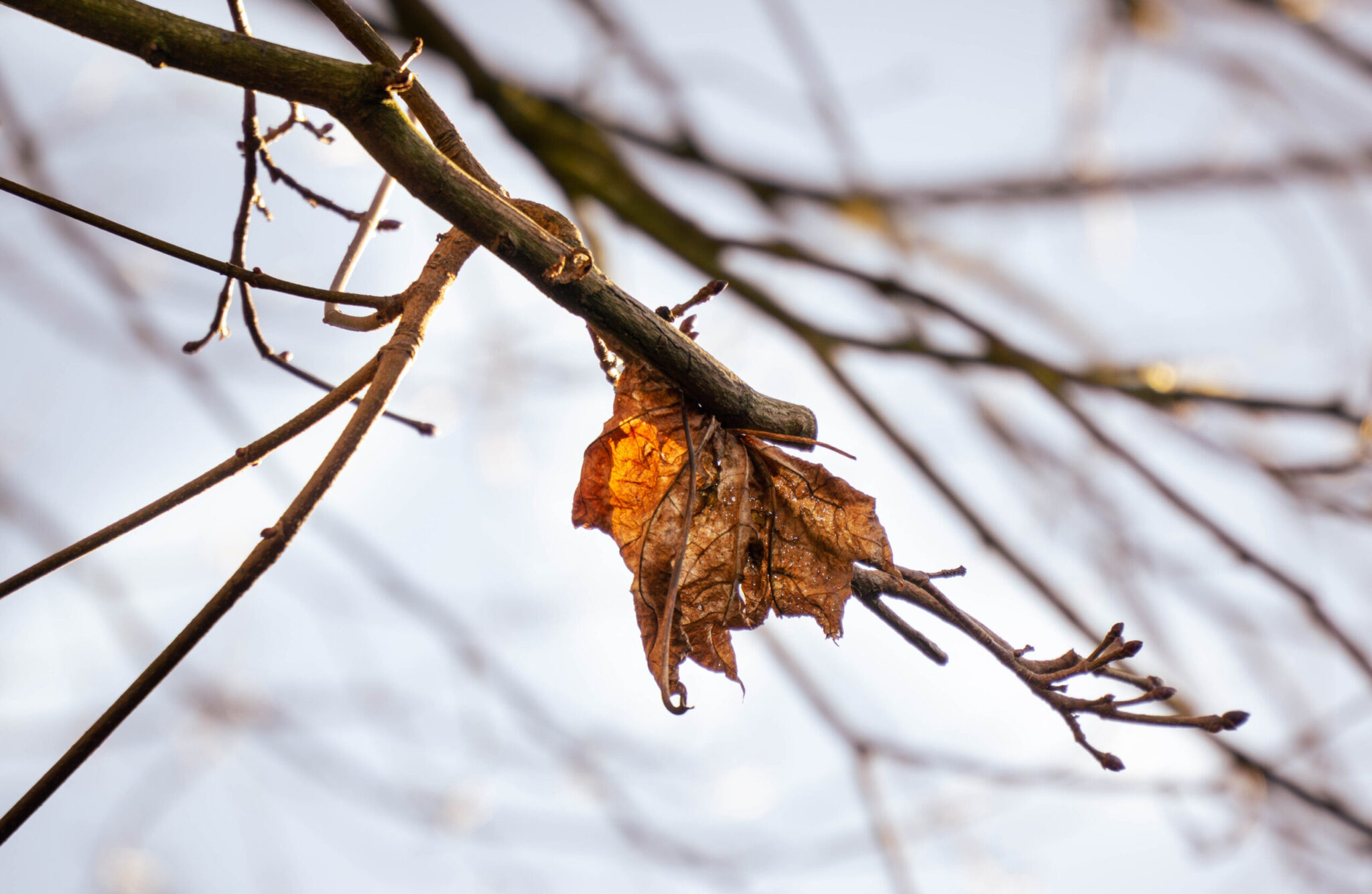
Furthermore I also learnt that adjusting colour temperature is not how to make an image warmer, this throws off all the colours in the image and makes it feel unnatural. Instead using the color mixer to put reds, oranges or yellows into the midtones and possibly the highlights too. This makes areas of light feel warmer while leaving other parts of the images natural. I also found that if a picture was already quite warm I could use the saturation and luminence tabs of HSL to boost that warm glow in golden hour.
Figure 10 – Example of using Colour mixing and HSL to make an image feel warmer
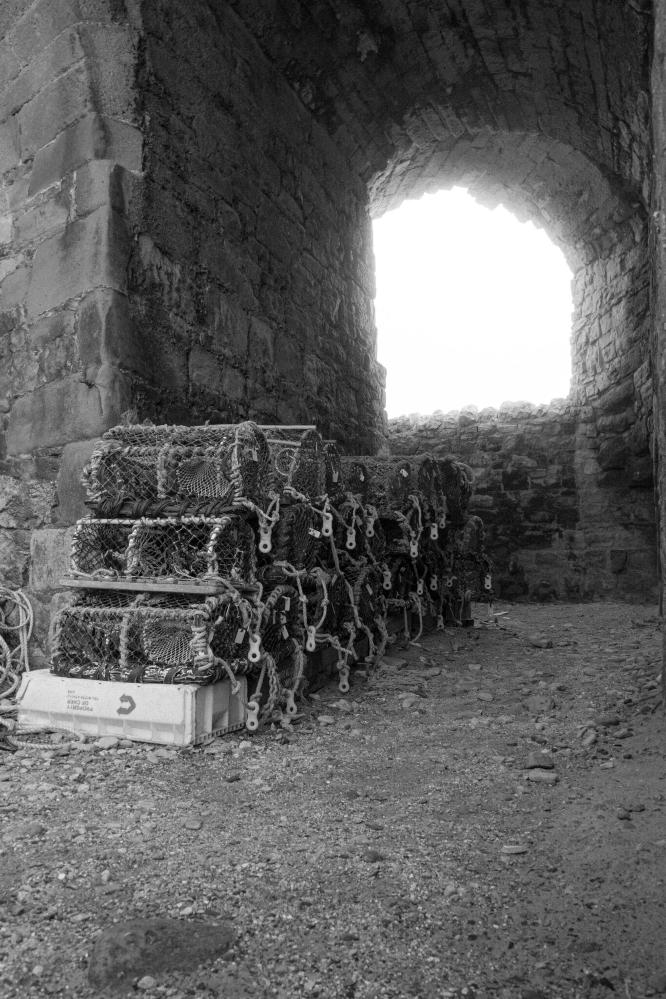
Further developing this I learnt that my black and white style was making pictures look more analog and noisy. I did this by boosting highlights and crushing shadows, creating a contrasty look, then using the whites and blacks sliders to push whites and pull blacks to create rich and contrasty images. Then using masks where needed to create vingettes almost and also to create subtle roll offs in skies or distracting elements. Then once I had done all of this for images I was adding lots of intentional grain in Lightroom, doing so gave the images an authentic feel and a non-perfect feel. Before adding grain the images felt off, overly digital and perfect, I wanted to add some grit to them, even going as far to reduce clarity to make the images glowy and harsh seperation between shadows and hightlights to smooth out and blur, see figure 11. For some images though I decided that applying the clarity loss across the whole image made them feel too soft, which is why in figure 12 you can see that the crab nets are crisp and sharp while the arch of the structure is glowing with the light coming through it.
Figure 11 – Shoot 10 – Example of black and white style
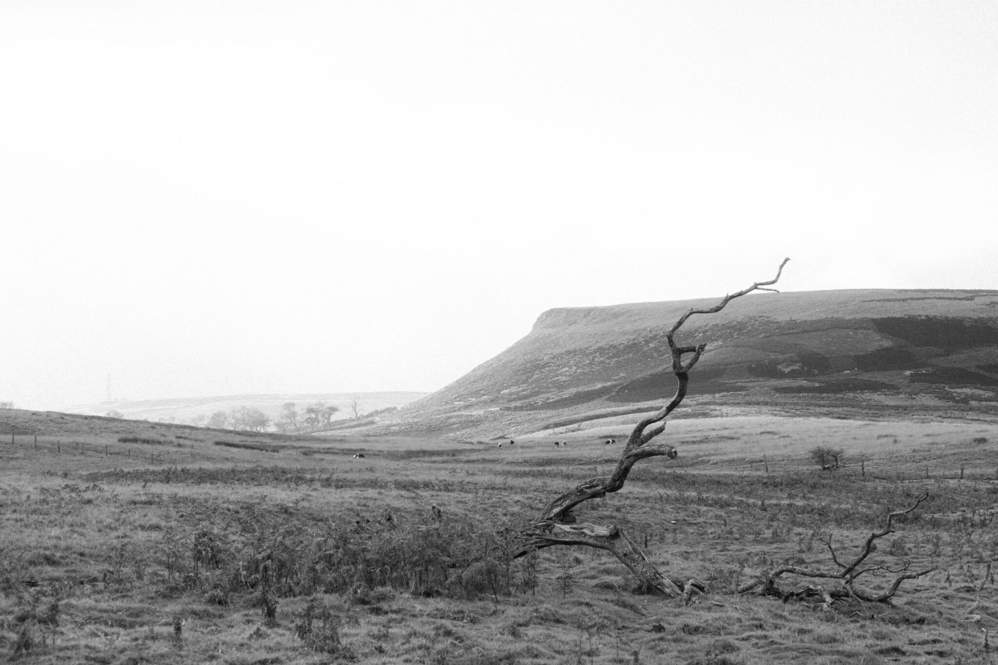
Figure 12 – Shoot 9 – Example of selective quality degradation
Section 3 – Describe the context of your work (influences, purposes and meanings)
I plan to use a range of contextual sources to inform my project, including artist sudies, gallery visits, book references and wider contextual sources. The reason I want to study nature photography is because I was influenced by the environment workshops and watching photographers on YouTube doing photography in the natural world. I plan to document both written and visual inital ideas to show my project intentions and influences by creating a mindmap and a pintrest visual inspiration board. Having undertaken some inital research as part of the workshops, I plan to expand my knowledge with relevant artist and photographers to focus my project on mood, atmosphere and composition. Having carried out some online research I have discovered the work of Fay Godwin and Adam Burton. I plan to collect relevant visual examples of their work to inspire and inform my own ideas, I will also analyse their work to gain a deeper understanding behind the technical elements and aesthetic choices made by the artists.
Section 3 – Reflection
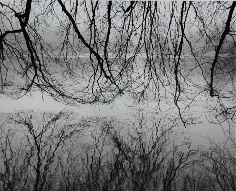
Over the course of this project I have used a broad range of contextual sources to influence my work, in particular Fay Godwin where I have been inspired by her editing style and have experimented with this. In response I have investigated making a contrasty, deep black and white image. This can be seen in Figure 13 where in shoot 1 I have tried to edit a photography in the style of Fay Godwin. Being able to replicate a similar style to Fay Godwin shows my technical skills in post processing.
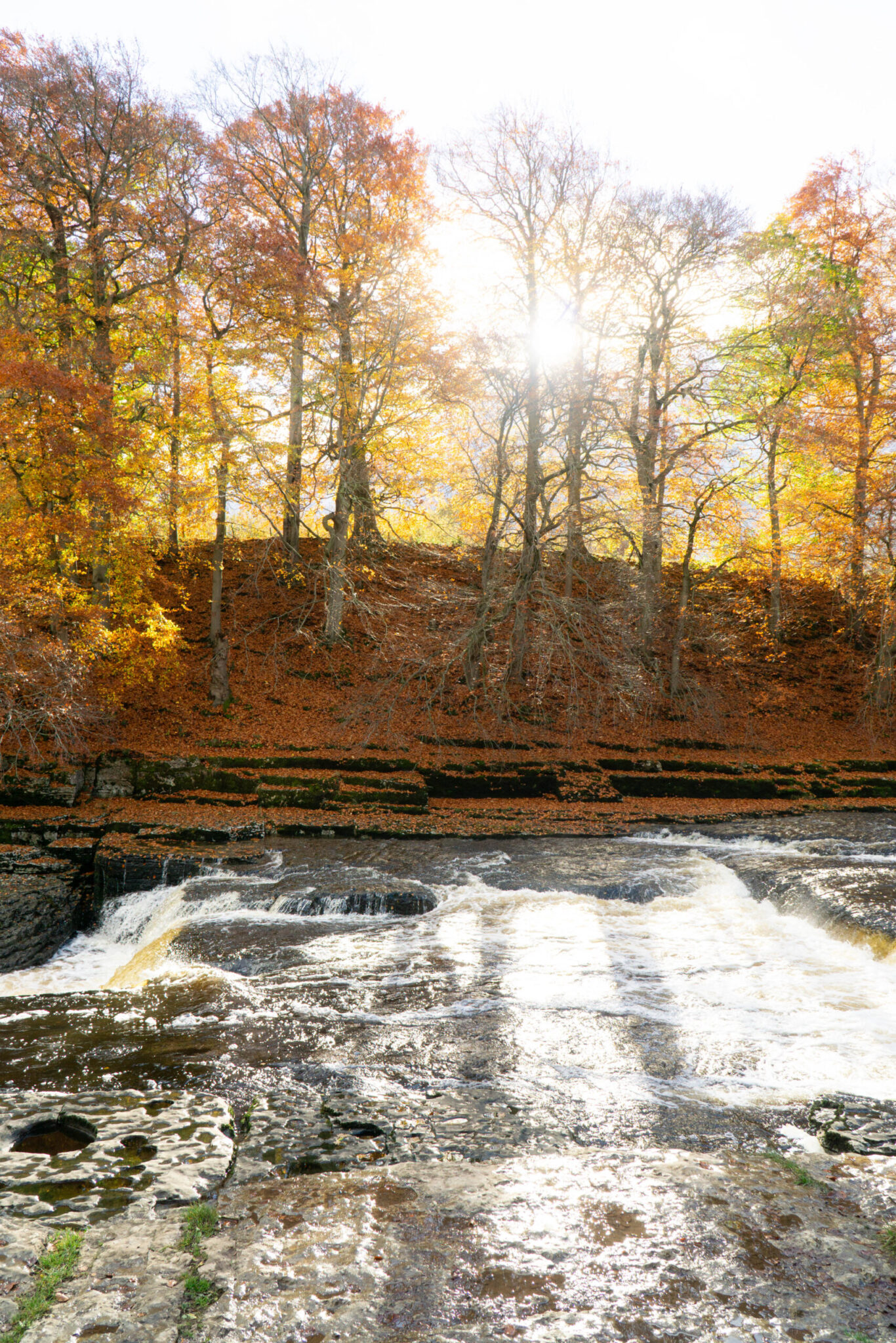
Moving on from this I have then also been inspired heavily by Adam Burton for his compositons, being powerful while subtle. Also being inspired by techniques like slow shutter speed to blur motion, in particular water moving. Thus showing my knowledge of how to balance shutter speed, ISO and aperture and even the use of an ND filter to reduce light input into my camera and also showing that I am aware that a slow shutter speed will cause blur of motion and therefore I must use a tripod in order to get a sharp shot.
Figure 13 – Fay Godwin – Example of deep blacks and harsh highlights – Inspiration Photo
Shoot 1 – Black and White edit with similar style.
Figure 14 – Adam Burton – Example of a photo down a river with amazing compositon, lighting and beautiful blurred motion.
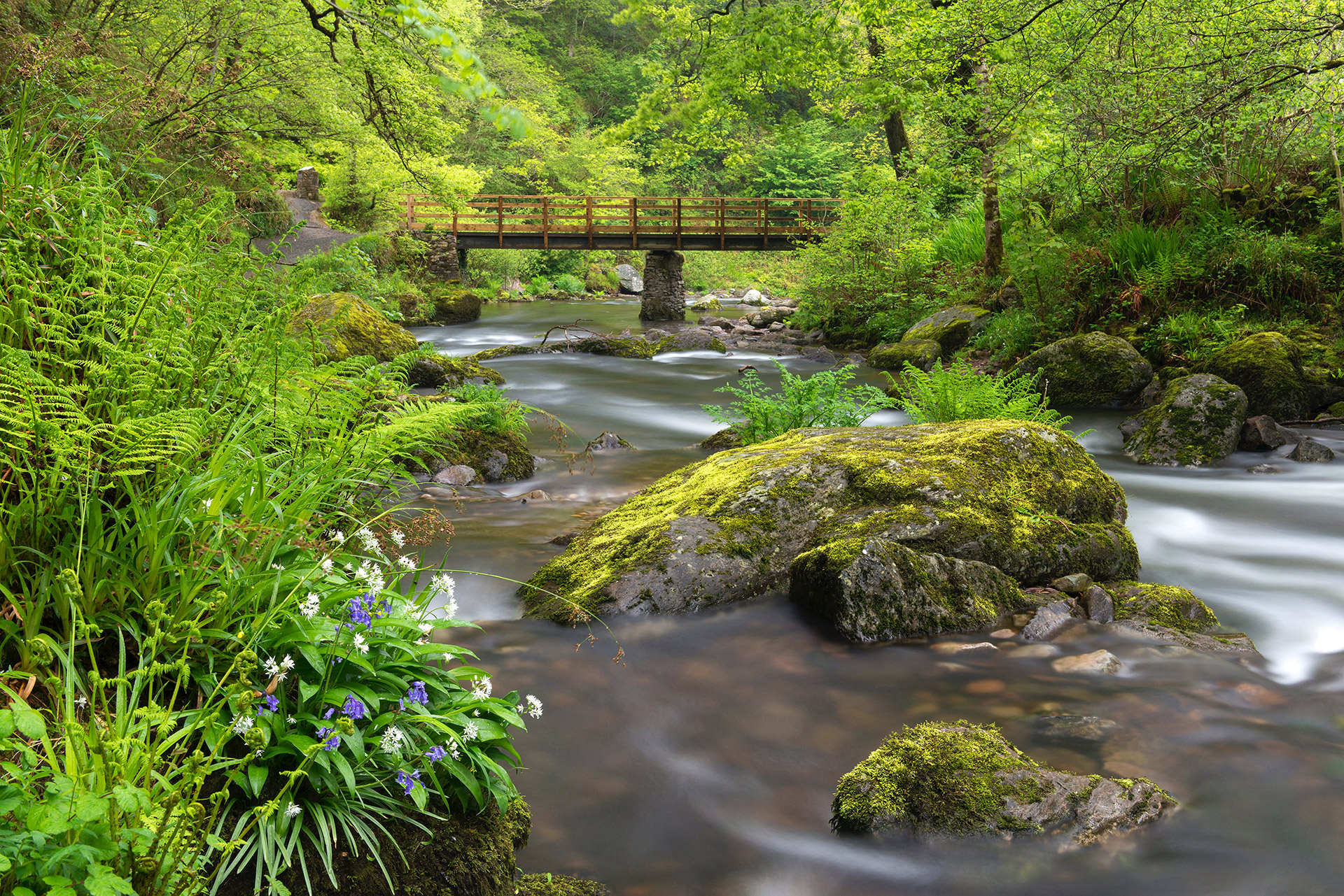
Shoot 8 – Following a similar compositon style but was unable to have the same blurred motion due to having no tripod on this shoot.
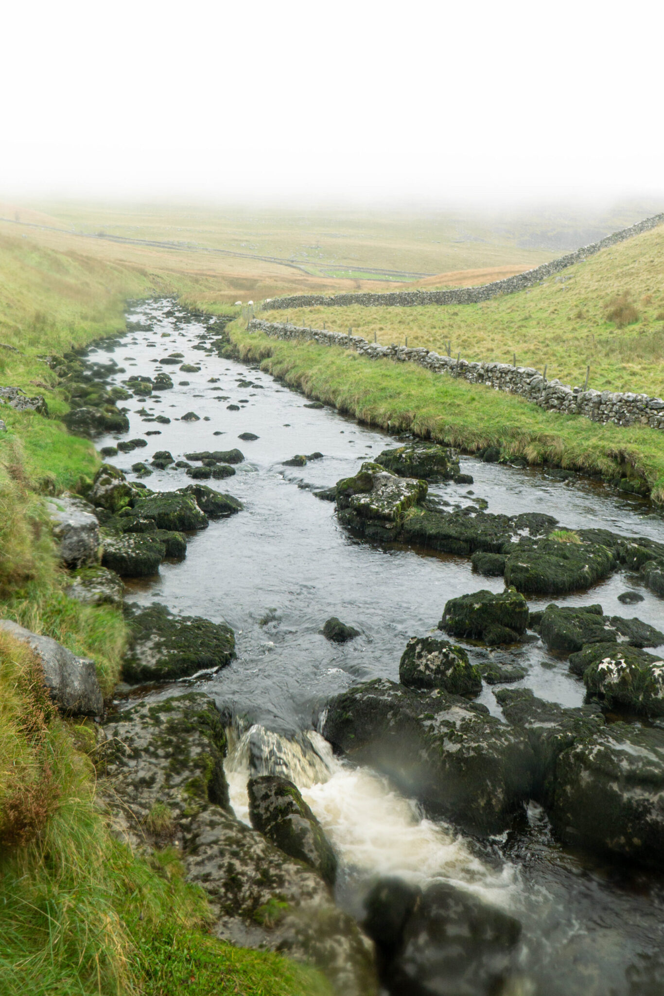
Figure 15 – Adam Burton – Example of Blurred Motion of water in a river.
Shoot 5 – Blurring motion of water in inspiration from Adam Burton. I used a tripod to get this shot.
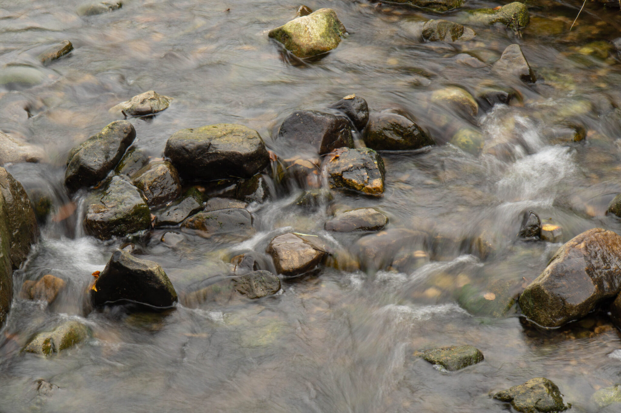
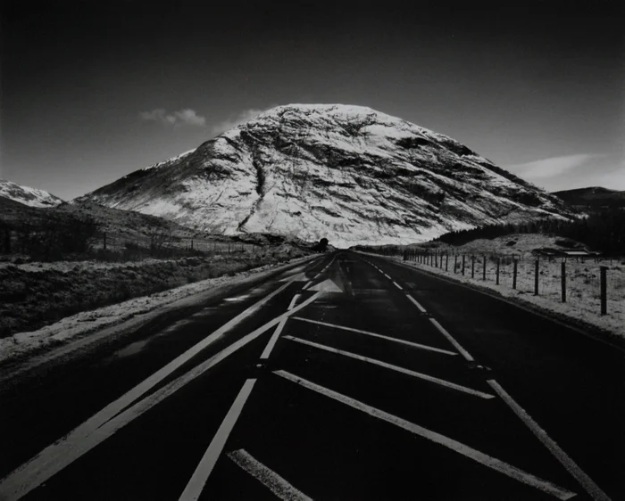
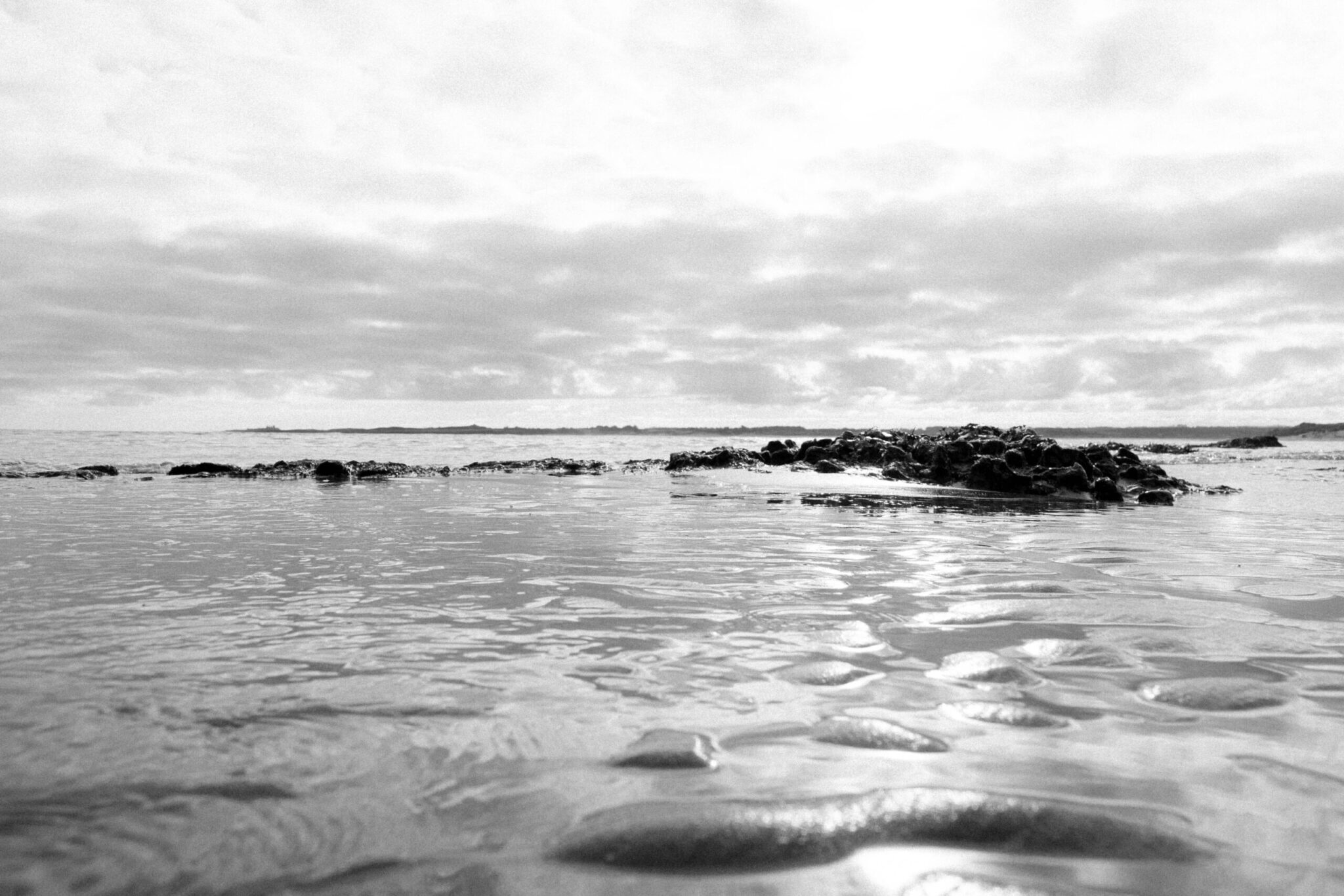
Figure 16 – Fay Godwin – Bright Black and White without much deep contrast.
Shoot 9 – Picture of the beach following a similar style of editing to Fay Godwin’s image.
Section 4 – Reflect on your work critically as it progresses and on its completion
During the inital stages I was pleased with the quality of the images and the compositon of some of my images. I found that going out just after midday meant shadows were not too long and there was enough avaliable light to be able to easilly do handheld shots with a high shutter speed and still get enough light into the camera. Allowing my self to direct this project and really take ownership over it has allowed me to develop a unique photography style while being inspired by artists already in the space. A lot of my images composition is meant to show isolation of one thing or have the idea of the viewer being isolated.
As my project progressed I focused on exploring colour manipulation and how to colour grade an image to make it true to life, this really started to show in Shoot 9 and 10 where I started to get a good grip on the tools at hand. I also developed my own Black and White style which I fell in love with which you can see in Figure 16 – Shoot 9 and Figure 11 – Shoot 10.
I also experimented in one shoot with going out in terrential rain, while this was a risk to take with my gear, some of the pictures I got from it were truly worth it. A lot of my pictures were obscured by the rain drops on the lens which added a unique styling and atmosphere to them.
One challenge I found was transport and getting to certain places, however, I did find that if I walked around my local area I could find unique frames, easilly. It was mainly an issue as I wasn’t able to drive myself to places I wanted to go so I had to rely on others.
Another challenge I had is that when I started the Photography course I had not use Lightroom for ages, I was a little slow at getting back into it but now I have made a workflow that works great for me. I have been able to develop this through a selection of workshops and my own self-teaching. Once I understood the main parts of Lightroom I was able to really get stuck in and not worry so much about the controls but more the content I was producing and I started to really feel in control of my images and started to get the results I wanted towards the end of this project.
One challenge which was particully anoying was that my laptop broke down a few times and had to go back to the manufacture, each time this happened I had to move all of my active work from my laptop to my desktop. Because of this I later began to use an external SSD for my active work, meaning I was not tied to a specific machine and instead could use near enough any machine with Lightroom.
For my final piece I have presented 3 inital unique presentation ideas with adequette research and mock ups of what they could each look like. After completeing this research and working with the mockups, I decided to refine and finish the Photobook idea which I made in InDesign. I decided on a Photobook as I thought it would best represent my work and what I wanted to create and show. Allowing me to include as many or as little images as I wanted to and being able to let the viewer focus on my pictures without distractions of an article of a magazine or the sound in a gallery. By using a Photobook my viewer can be anywhere rather than somewhere specific.
Bibliography
https://en.wikipedia.org/wiki/Fay_Godwin
https://www.adamburtonphotography.com/
https://www.instagram.com/manfredteh